
My Gym
A children’s fitness and learning center that offers weekly curriculums lead by instructors.


Employee intranet
Product
UX researcher & designer
Role
Approx 200 hours
Timeline
Figma & Figjam
Tools
Background
My Gym is a children’s fitness center that offers classes to promote physical and cognitive development for ages 6 months - 10 years old.
Instructors are expected to lead classes based upon weekly, age-specific curriculums which are posted in the My Gym intranet.
I was an instructor at My Gym while pursuing my education in UX, and I initiated this project as a way for me to exercise my research and design skills.

A video about My Gym!
Problem
After conducting user research, I discovered a trend among my fellow instructors.
My Gym instructors feel confused, irritated, and overwhelmed about the process of finding and retaining curriculum information.
The current designs of the curriculum pages on the intranet are causing instructors to devote a large amount of time to learning the curriculum which results in burn out, low retention of information and possible inconsistent class experiences for students.
Goals

Scope
Since the objective of this case study focused on instructors learning weekly curriculums, the project scope was limited to the curriculum tab.
Constraints & Challenges
I had to design without altering content or style to remain consistent with My Gym branding.
I also had to work alone and without feedback or collaboration from My Gym’s designers, developers, and stakeholders.
A glimpse at the solution
I redesigned the curriculum tab with greater visual hierarchy and enhanced scanability. I also added 2 new features to promote efficiency and teamwork.
Users reported increased satisfaction and usability after I tested these changes.
1.
New Hierarchy & Information Architecture
The curriculum navigation bar was revamped by optimizing on the available space, centralizing information from curriculum-related content, adding tabs to organize the content, and adding dropdowns to further organize these sections. This redesign was favored in user testing, and users reported that it helped them navigate more accurately and with ease.
Navigation Bar Before…
Navigation Bar After…
Accordions and quick view buttons were also added to the curriculum details on the class pages to reduce scroll time and information overload.
Class Page IA Before…
Class Page IA After…
2.
New Features
A favorites section was added to the curriculum library to improve customization and efficeincy.
A virtual notepad was added to help users save and share important notes.
The Design Process


Empathize

User Interviews
I interviewed 4 My Gym instructors. Interviews took place at My Gym Chicago South Loop after the weekly team meeting where instructors review curriculum details.
The location and timing was strategic to catch the users in the space and time where they actually use the product.

User Interviews Insights
Notable likes:

Instructional images, videos, and audio
Talking points and lyrics
Notable dislikes:
Long scroll time
Large blocks of text
Design inconsistencies
Notable feelings:


Overwhelmed
Unsure

Frustrated
Trends:
100%
of users noted that the curriculum pages are text-heavy and can feel overwhelming.
100%
of users mentioned that videos, audio, and images help them learn and retain the curriculum information.
75%
of users feel confused and frustrated when searching for a week’s curriculum due to design inconsistencies.
50%
of users said they make their own notes and often share with team members to help them summarize the information for easier future reference.
Secondary Research
In addition to interviews, I wanted to take a big-picture approach and learn about the industry best-practices for designing useful and engaging intranet sites.
I eventually landed on two relevant articles published by Nielsen Norman Group and Forbes. I have summarized my findings below.
Nielsen Norman Group

Intranet Usability Guidelines: New Findings From 57 Intranets
January 19, 2024
Intranet Content Management: Effective content management requires centralized oversight to ensure quality and findability. A four-part framework (planning, creation, maintenance, and unpublishing) enhances intranet content strategy.
Content-Management Models: Centralized models improve task efficiency, while distributed and hybrid models result in longer task times.
Information Architecture: Organizing content by tasks rather than departments enhances usability and task completion rates.
Search Functionality: A single search field is preferred for efficiency and clarity, with issues arising from inconsistent search placement.
Design Practices: Consistent visual design and clear navigation improve user experience, while inconsistency can lead to disorientation and decreased productivity.
Forbes

Boosting Employee Engagement: 16 Key Factors To Consider For An Effective Intranet Platform
July 26, 2023
Human-Centric Design: Effective intranets should focus on user adoption, productivity, and continuous improvement, incorporating AI to enhance personalization and usability.
Engaging Content: A cohesive narrative and aligned brand are vital, using stories and consistent messaging to build community and reflect company values.
Interactivity and Feedback: Platforms should encourage employee input and interaction through features like feedback channels and opportunities for connection and collaboration.
Technology Integration: AI and automation can improve productivity by streamlining workflows and enhancing user experience.
Education and Communication: Intranets should educate employees on benefits and company news, involving multiple departments in content creation.
Define
User Persona
This is Annie! She represents the type of user who needs to learn the curriculums quickly and easily to keep up with her busy student lifestyle. Large amounts of text are challenging for her to sort through, and she prefers to learn through short notes, photos, and video clips.
Annie strives to be an all-star My Gym instructor, but she wishes she could spend less time and energy preparing for classes.

After reflecting on Annie’s needs and challenges, I defined 3 HMW’s to help guide my designs.
How Might We…

Develop a level of intuition and ease while users navigate through the platform?
Arrange curriculum information in a way that is quick and easy for users to consume and understand?
Reduce information overload without eliminating important curriculum content?
To help set me up for my sketches, I developed user flows based upon what my users identified as their most commonly performed tasks. I also made user flows for the new features once I decided to move forward with building them.
User Flows
Legend
Flow #1: Current week curriculum review
This flow addresses the need for intuitive, simple navigation. It uses minimal steps to get users to their end goal and allows for easy back-tracking if needed.
Flow #2: Alternative week curriculum review
This flow solves for a pain point that users reported about inconcsistent navigation to past and future weekly curriculums. The goal of this flow was to simplify and streamline the navigation and provide users with a consistent, reliable way to locate alternative weekly curriculums.
Flow #3: Adding to favorites
This flow solves for speedy navigation needs while adding the bonus of customization for users. The intention here is to allow users to craft their own navigation experience, placing classes they teach most often within quick and easy reach. This is a brand new feature to speed up the task of finding a specific class curriculum.
Flow #4: Adding and sharing notes in notebook
This flow considers users’ needs for note-taking and collaboration. This is a brand new feature for a task that was previously done via email or post-its.
Ideate

Low Fidelity Wireframe Sketches
I began to develop my visual design ideas by sketching low fidelity wireframes. These sketches evolved throughout the rest of design process, and this is where it all began.

Digital Wireframe Fidelities
Next, I used Figma to bring my sketches to life by building digital wireframes. Below is the evolution of the digital wireframes.
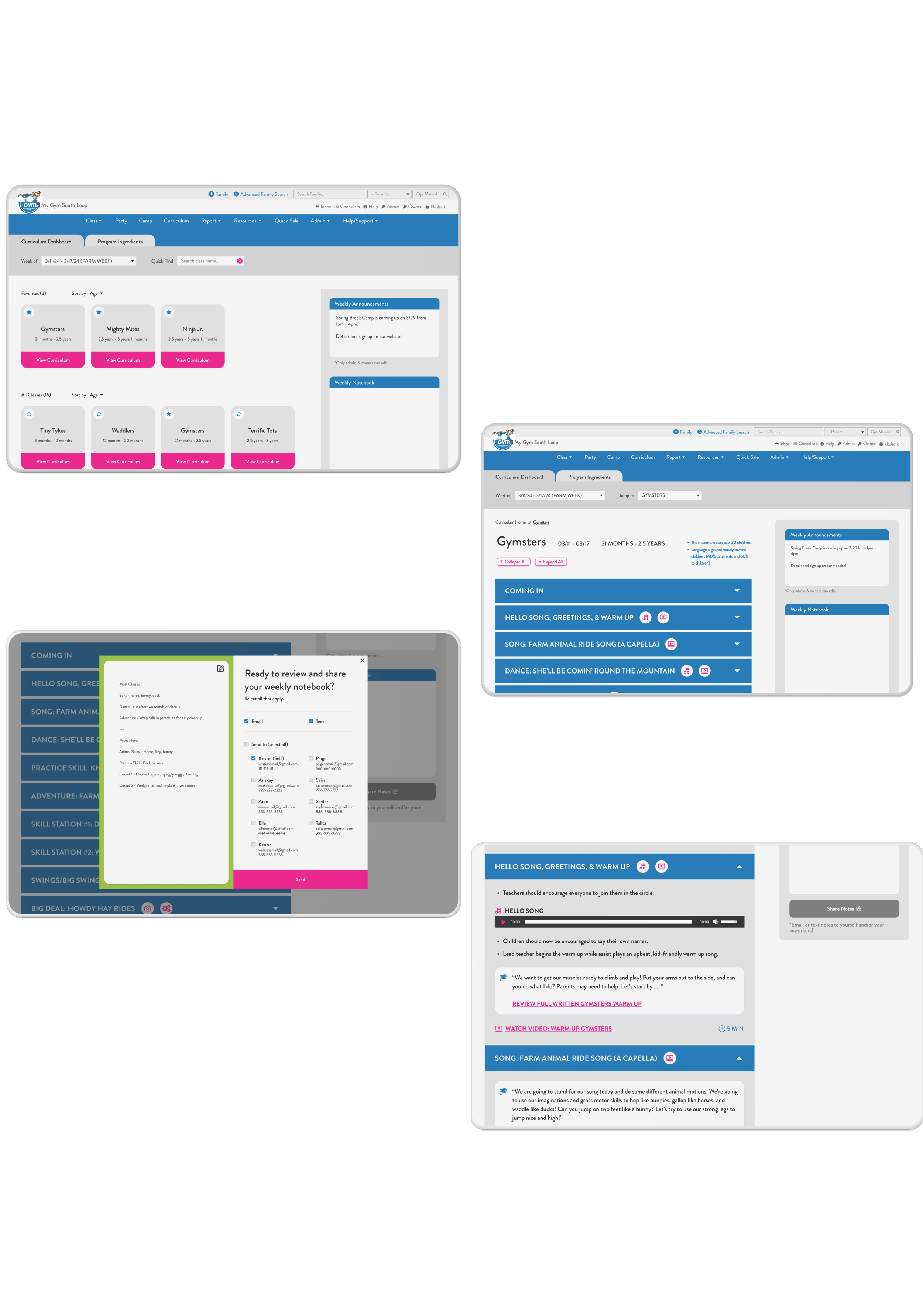
Curriculum Tab Home Page
Class Page Collapsed View
Class Page Accordion Expanded View
Digital Notebook
UI Kit
My Gym provided me with their UI Kits for this project. I used the exact HEX numbers in my designs, and I was abe to obtain the Brandon Grotesque fonts.

Prototype

High-Fidelity Prototype
I chose to build an interactive prototype with my final desktop screen designs.
I chose the desktop screen size, because most users use desktops to review curriculum materials.
These designs are the final version after implimenting the feedback I had received in my user testing.
Test

Usability Testing
I tested 8 task flows from V1 of my prototype on 5 users. I individually met with each user at the gym, and I asked them to think out loud as they explored the new designs.
I recorded their errors and asked them to rank each task on a scale of 1 - 5 (1 = Very Difficult and 5 = Very Easy).
Task Flow Test Results
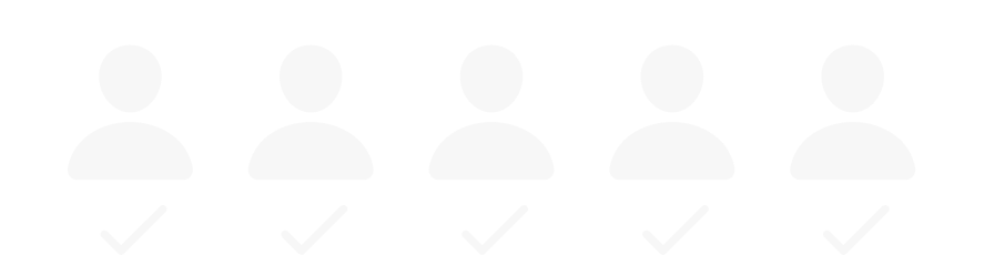
The following 7 out of 8 task flows received an ease score of 5 out of 5.
Tasks
Look ahead to next week’s curriculum.
Add Gymnastics Beginner Level to favorites.
Review Gymsters Curriculum for Farm Week.
Expand all tabs and collapse all tabs.
Add notes for yourself.
Share your notes with a peer.
Return to the Curriculum home page to browse.
100%
of users completed these tasks error-free.
1 out of 8 task flows received an ease score of 4 out of 5.
Task
Locate the shortcut to view a photo for Adventure set up.
80%
of users completed this task error- free.
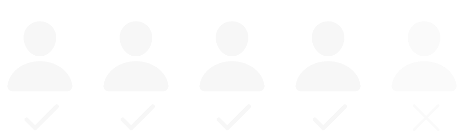
The user who missed this task said that they initially thought they would find it somewhere in the menu, but then they realized they were overthinking it. When they discovered the correct path, they said it made sense.
User Feedback Trends
5 out of 5 participants liked:

The use of colors.
The intuitive navigation.
The new Notebook feature.
The audio/visual shortcuts in the accordions.
4 out of 5 participants liked:

The layout of the curriculum cards.
The ability to expand and collapse accordions.
The new Favorites feature.
The speed and efficiency of navigation.
2 out of 5 participants suggested:

Beter affordance on the collapse/exapnd buttons.
Building responsive designs for mobile and tablet screens.
1 out of 5 participants suggested:

Creating an admin version.
Creating a way to see multiple weeks at once on the home page.
Stress Scale Averages Home Page
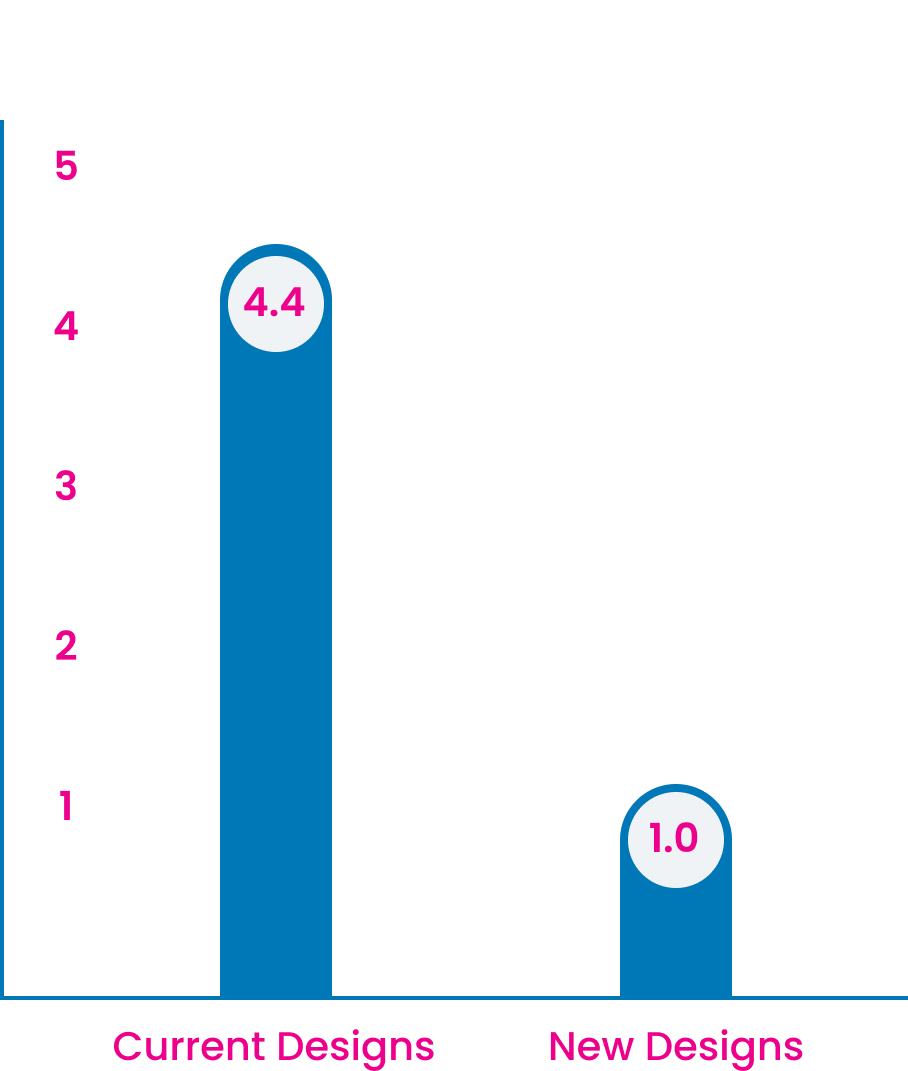
Stress Scale Averages Class Page
1 = Low Stress | 5 = High Stress
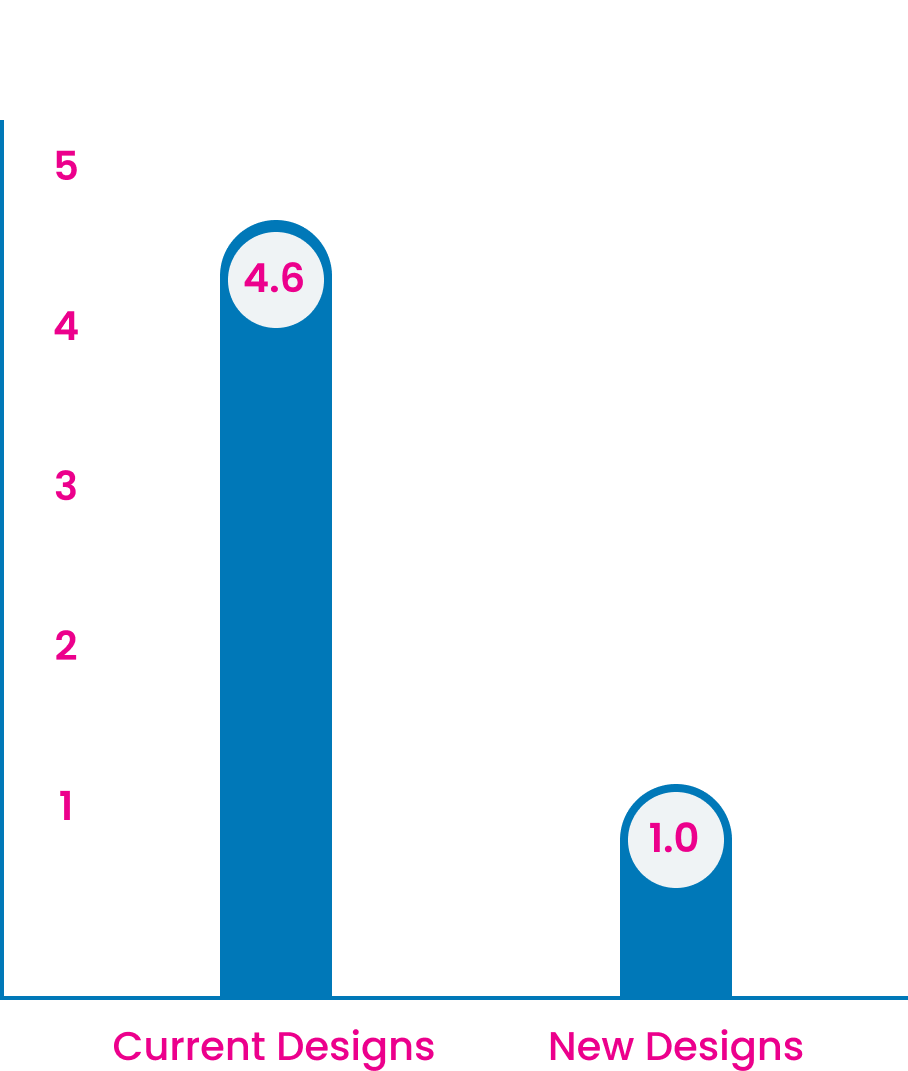
New vs. Current Designs

The participant who voted 0.5 explained that they would be fully in favor of the new designs if admin features were added.
This participant was a manager and stated that they need a better way to customize the curriculums by cross-checking upcoming weeks in multiple tabs.
Conclusion
After taking user feedback into consideration, I made a few iterations on my designs as well as a product road map.
Iterations Made
Enlarged collaspe/expand buttons and increased stroke weight
Added an Multi-Week View to the weekly dropdown
Next Steps
Build out admin features for simple toggling between weekly curriculums.
Make designs responsive to tablet screens.
Make designs responsive to mobile screens.
Reflections
This project was a delight for me to work on. I learned a lot about the importance of setting aside my biases about the product, and I noticed that doing so allowed me to see other perspectives.
It was extremely rewarding to watch users test the product and share their impressions out loud. They validated my hard work and even asked me if we could impliment these changes immediately.
As I move forward in my career, I would like to tackle more projects like this.