
Growth Space Therapy
Responsive web design for desktop and mobile screens for a budding small business using Figma and Figjam.
Client: A mental health provider
Timeline: 200 hours
Role: Sole UX researcher & designer
Background
This project was my first pro bono work as a UX designer. My client was a therapist who currently works at a clinic in Tennessee. She plans to launch her own private practice soon, and she asked me to design a website from scratch.
I saw this as a great opportunity to design for a small business, as timeline was flexible and the product was familiar. My client gave me several websites to reference as inspiration, and we worked closely throughout this project to achieve her vision. Along with UX research and design services, my services included: editing her professional bio, branding, and writing all other content on the website.
Problem
Prospective therapy clients may feel overwhelmed and apprehensive about connecting with a new therapist when information is not easily accessible.
Lack of information can cause a prospective client to disengage and move on in their search to find a new therapist.
Goals
Scope
Empathizing with website users is paramount for my client. Based off of research, I divided the overall experience into two phases.
Phase 1: The New Client Experience
Phase 2: The Existing Client Experience
This case study focuses on Phase 1 of the website, because acquiring new clients will be impairative once this business opens.
So what solution do new therapy clients want?
They want a website that is: transparent, easy to navigate, and efficient.
They also want a brand that feels calm, trustworthy, and friendly.
And what does that look like?

Information about the therapist.
Straightforward, no risk scheduling.
Clear and accessible information on pricing.

Friendly and honest, branding.
Showcasing expertise and inclusivity.

Calm and approachable home page.
See how this project grew!

The Design Process


Empathize

User Research Methods
I chose to harness 3 UX research methods for this project.
Competitive analysis
Surveys
User interviews

Competitive Analysis
I reviewed the websites for the following three competitors and compared their site features and services offered.

Willow Counseling is a mental health clinic based in Nashville, TN with 8 experienced therapists on staff and 5 student therapists. Collectively, the team has a wide range of specializations, and they provide individual, couples, and group counseling services.

Living With Hope Counseling is a solo private practice for a therapist based out of Murphysboro, TN. She specializes in a wide range of therapy topics and offers individual, couples, family, and children’s counseling services.

Empower Therapy is a mental health clinic located in Chicago, IL with 34 therapists as well as an administrative staff. They offer a vast array of specializations and sessions for individuals, couples, and medication management.
Surveys & User Interviews
I interviewed 5 participants after sending screening surveys to ensure that all individuals had experienced seeking therapy services online. I learned the following commonalities amongst the group.
100% of users said…
the onboarding process is a pain point due to the time and energy it takes to complete forms.
they want to learn a about a therapist before reaching out.
they prefer to virtually meet the therapist before committing to become a client.
Additional insights from users:

80% said they prefer to use insurance for therapy services, but they expect copays.

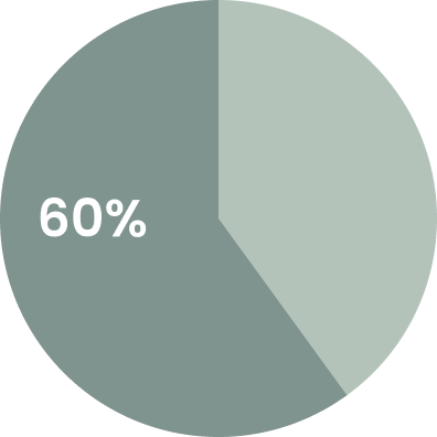
60% said they enjoy when a therapist lists their specialties and that it improves credability.
40% said they look at a therapist’s education details before reaching out.
Research Synthesis
Upon further review of my research notes, I identified best practices and practices to avoid when it comes to designing a website for a therapist’s office.
Best Practices

Detailed therapist bio
List of therapy services
Patient portal
Commitment-free consultation
Practice to Avoid

Vague or missing cost information
Confusing IA / searching too long for information
Requiring in-person sessions
Define

Personas
After analyzing the trends in my user interviews, I noticed that most users measure a therapist’s trustworthiness and compatibility by prioritizing personality/brand and credentials/specialties.
Millie represents a user who prioritizes a therapist’s personality and brand, because she is new to therapy and looking for a broad sense of warmness and transparency before she decides to reach out.

Stephen represents users who tend to prioritize a therapist’s credentials and specialties, because he is experienced with therapy and has specific expectations of his therapist and their background.

After reflecting on the personas’ needs, I composed 3 HMW Questions to help guide my design decisions.
How Might We…


Sitemap
With a focus on the new client experience, I constructed a sitemap to match what users said they needed to determine compatability with a new therapist.
I carefully considered full transparency and clear information architecture to aleviate some of the pain points that were identified in my user research.

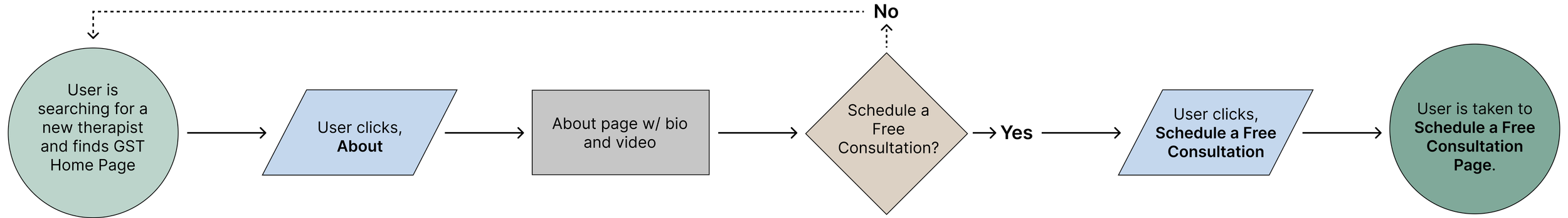
User Flows
I created detailed user flows for every page. The flows went through a few iterations throughout the design process based upon feedback from peers, users, and my client.
Legend

About Page User Flow: User visits the About page and either decides to schedule a consultation or continue browsing.
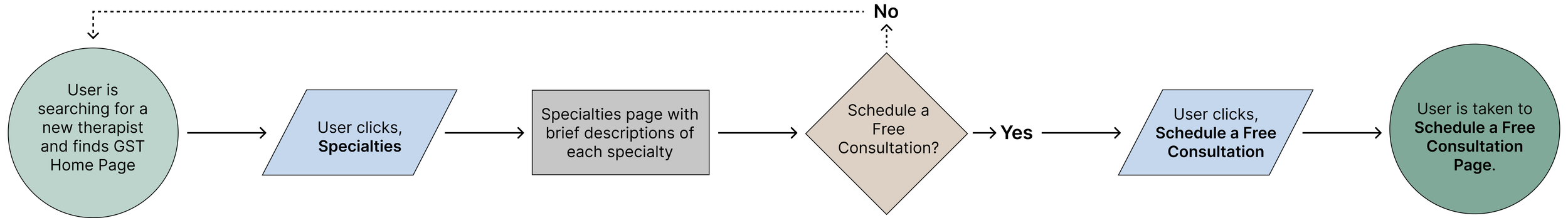
Specialties Page User Flow: User visits the Specialties page and either decides to schedule a consultation or continue browsing.
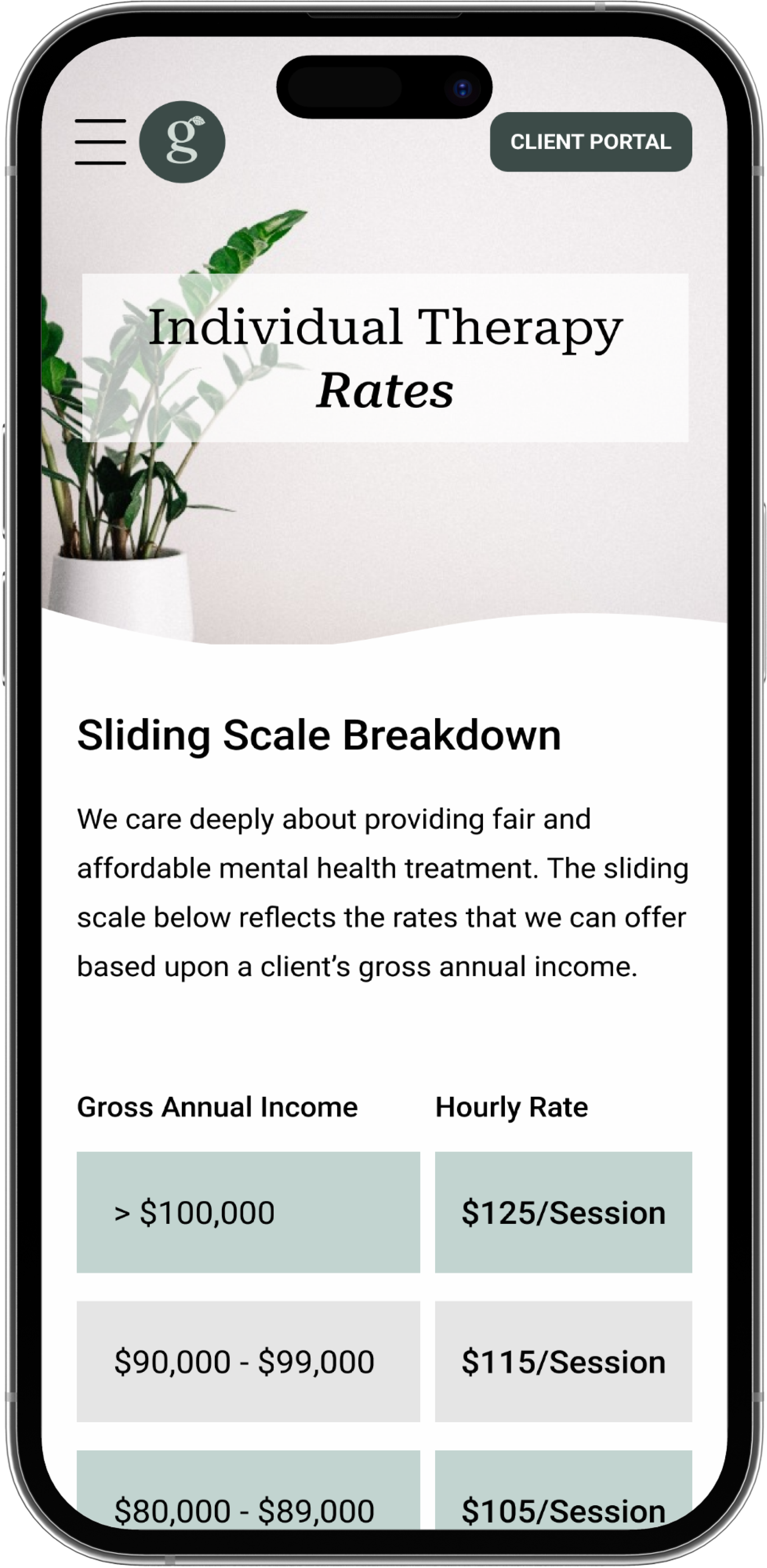
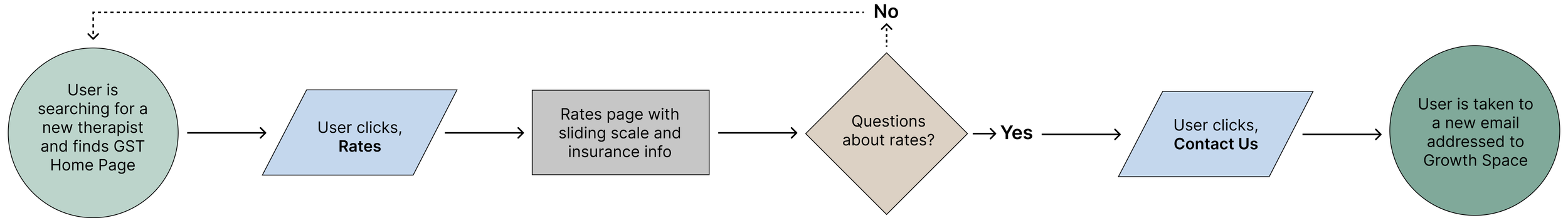
Rates Page User Flow: User reviews the Rates page and either reaches out for more information or continues browsing.
Note: The CTA is different here, because the client wants to avoid consultations for folks who are not comfortable with the payment structure.
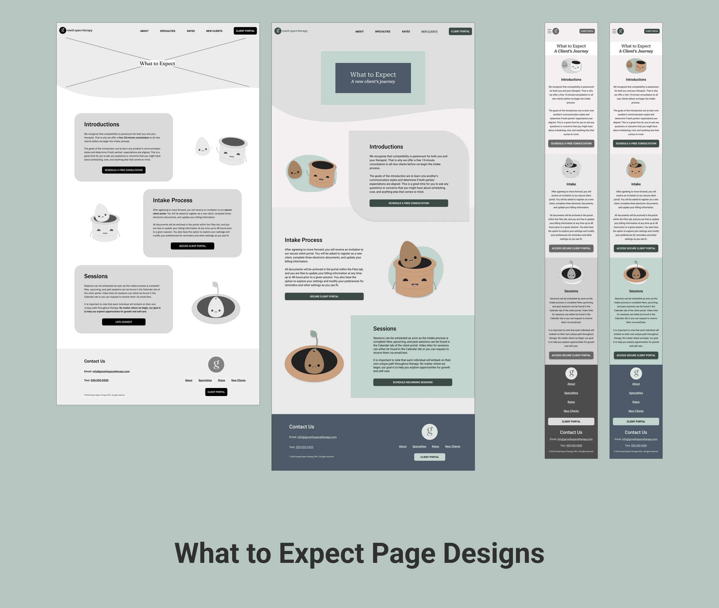
What to Expect Page User Flow: User reviews the What to Expect page and either decides to schedule a consultation or continues browsing.
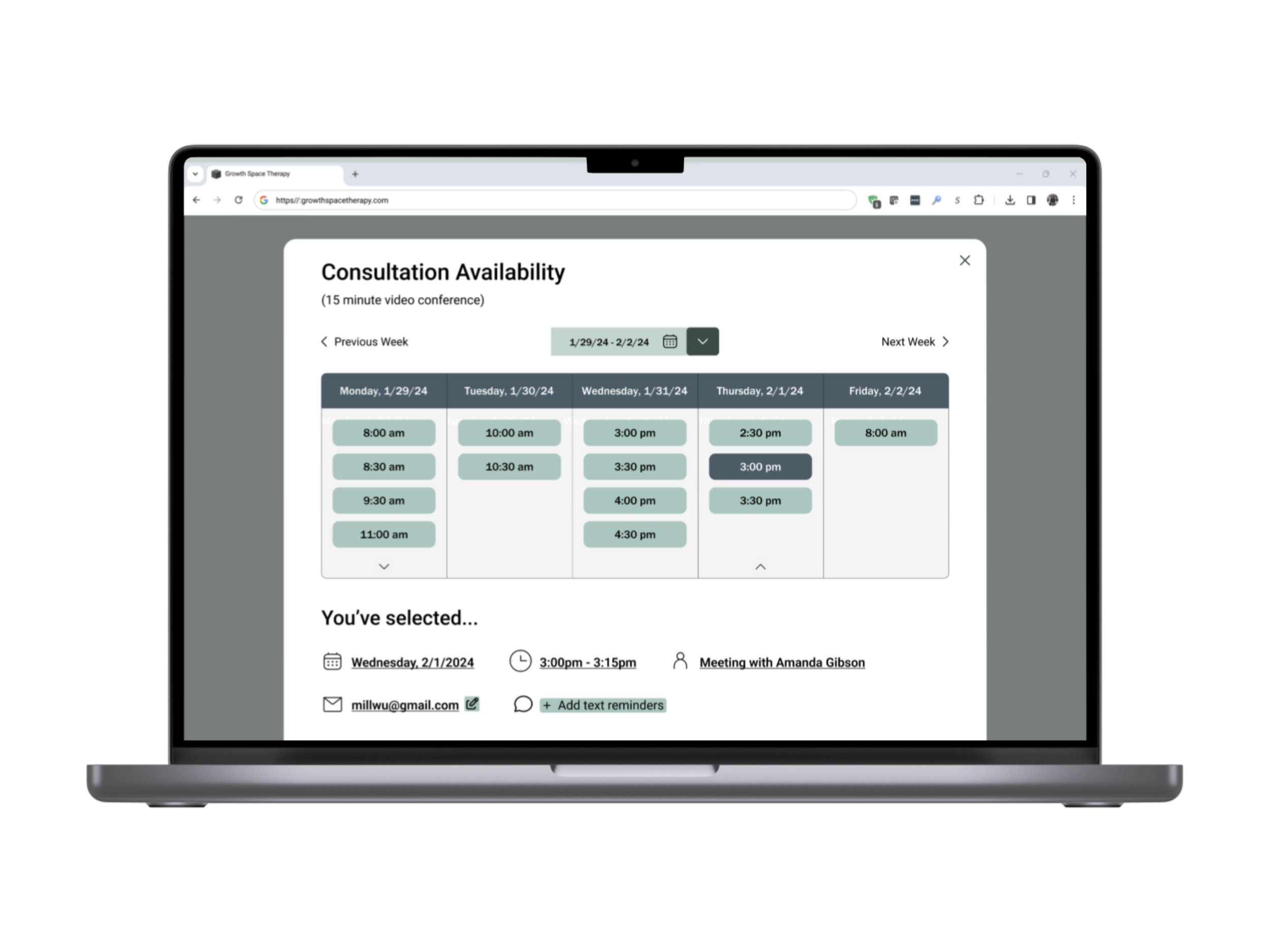
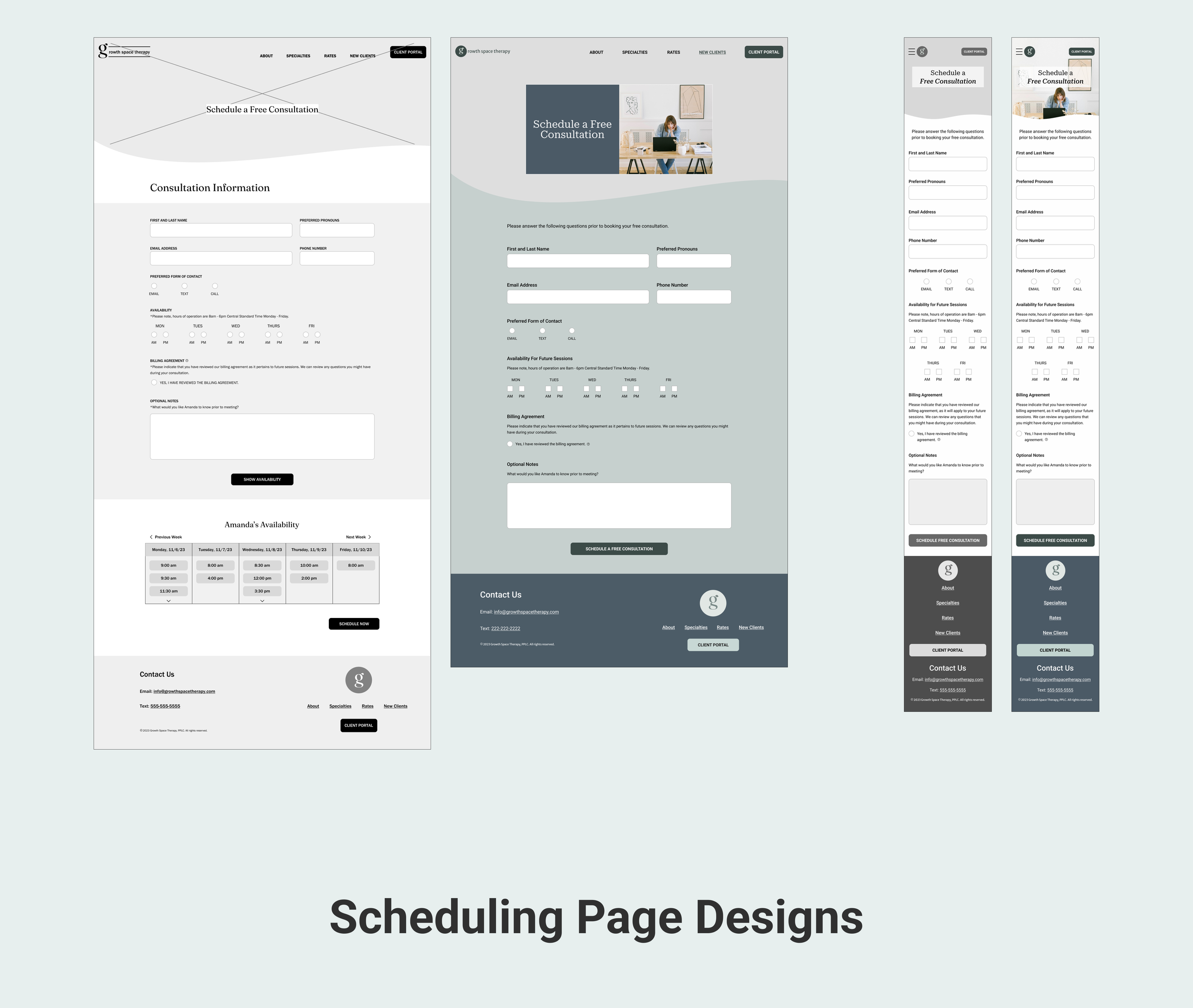
Schedule a Free Consultation Page User Flow: User visits Schedule a Free Consultation page and either schedules or resumes browsing information.
Ideate

Low Fidelity Wireframe Sketches
I began to develop my visual design ideas by sketching low fidelity wireframes for both desktop and mobile screen sizes.
Desktop
Mobile
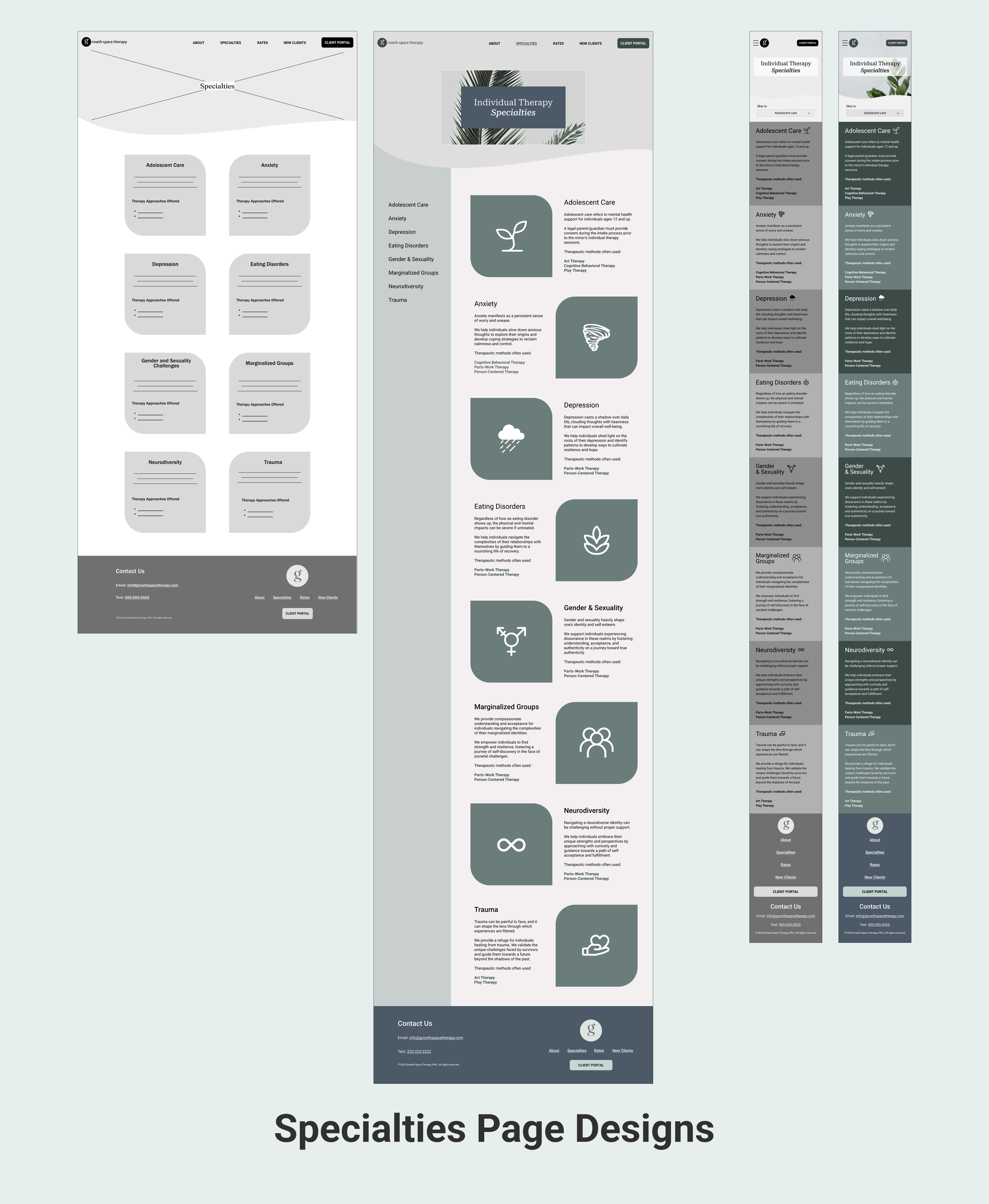
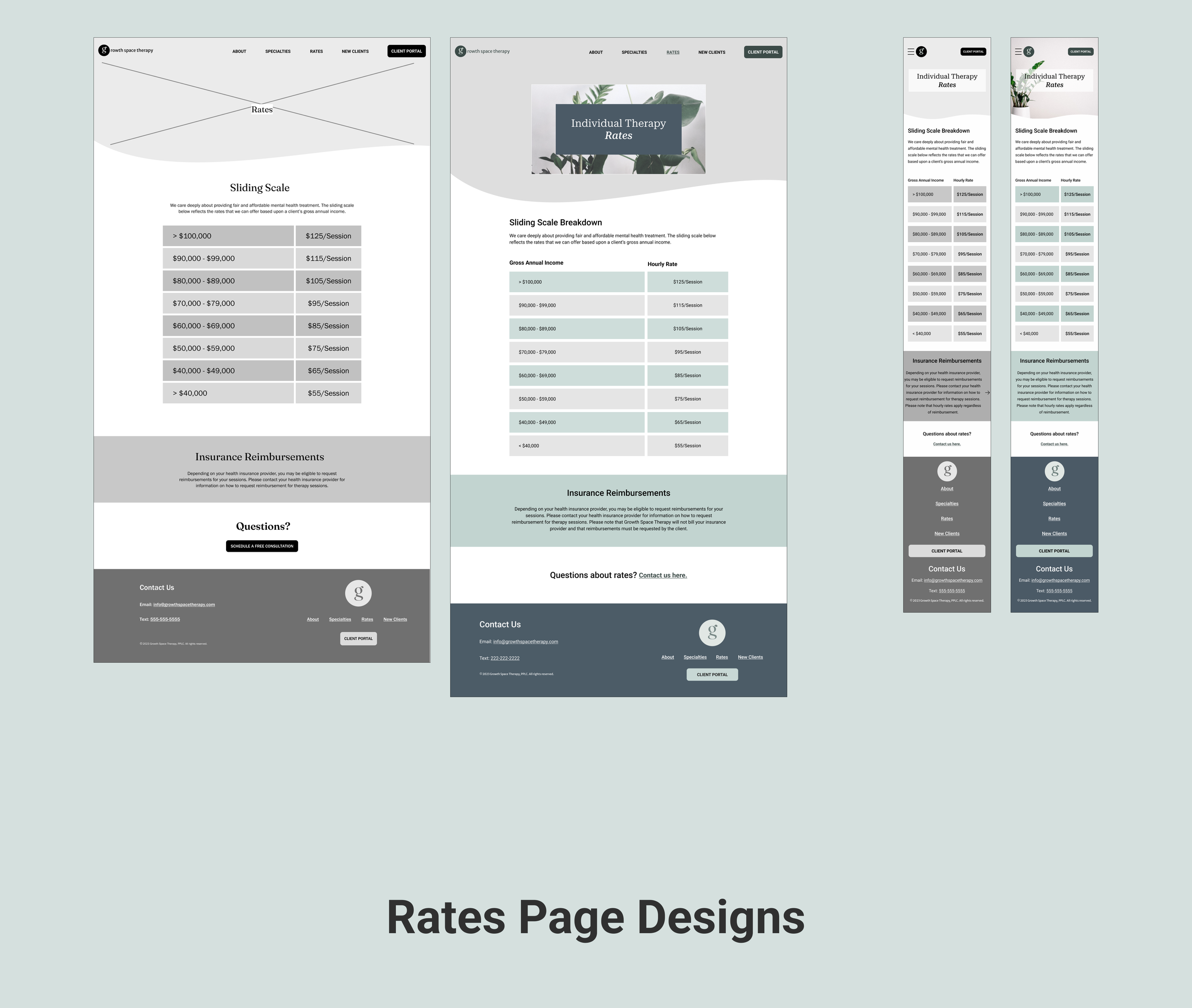
Digital Wireframe Fidelities
Next, I used Figma to bring my sketches to life.
I built digital wireframes and wrote all of the content for the webstie during this time. As the design process progressed, I made several iterations and applied a cohesive UI kit to all screens.
Below is the evolution of the designs from mid to high fidelity.


UI Kit
I composed a UI Kit to build a cohesive brand to impliment in the website’s visual designs.
Prototype

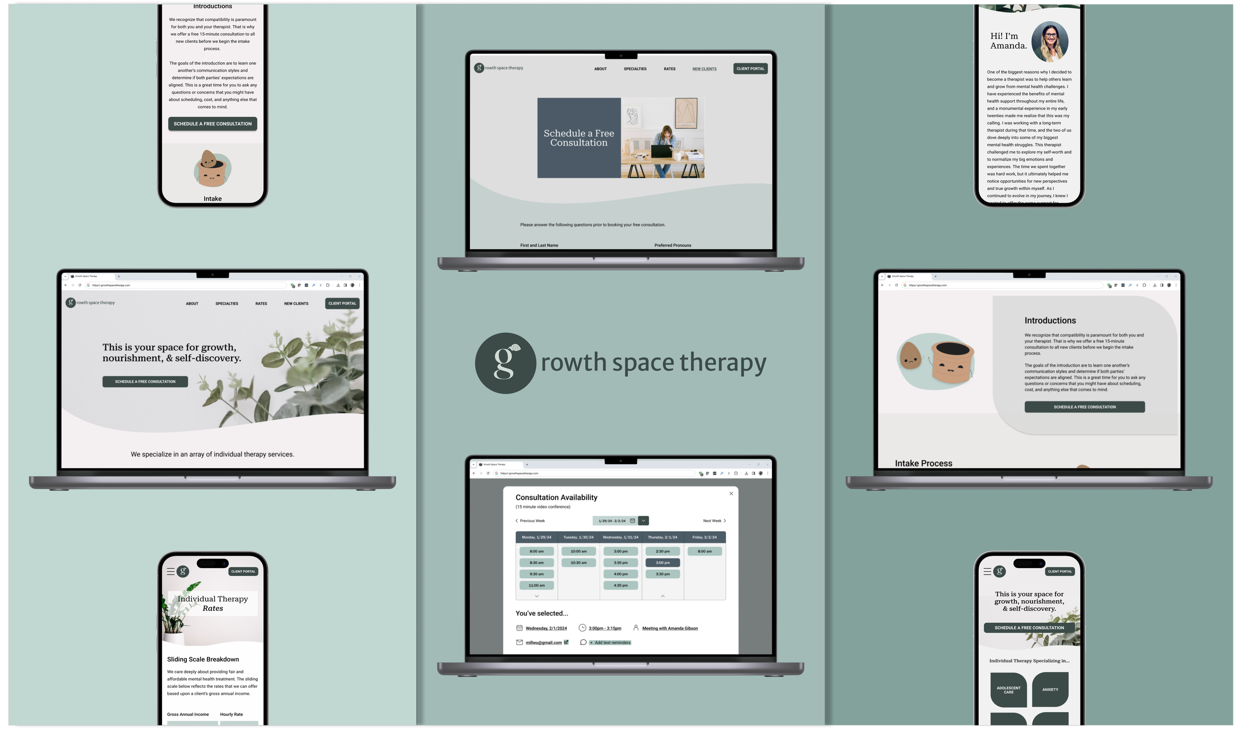
High-Fidelity Desktop Prototype
I chose to build a comprehensive interactive prototype with my final desktop designs, because most users reported viewing therapy websites on desktop screens.

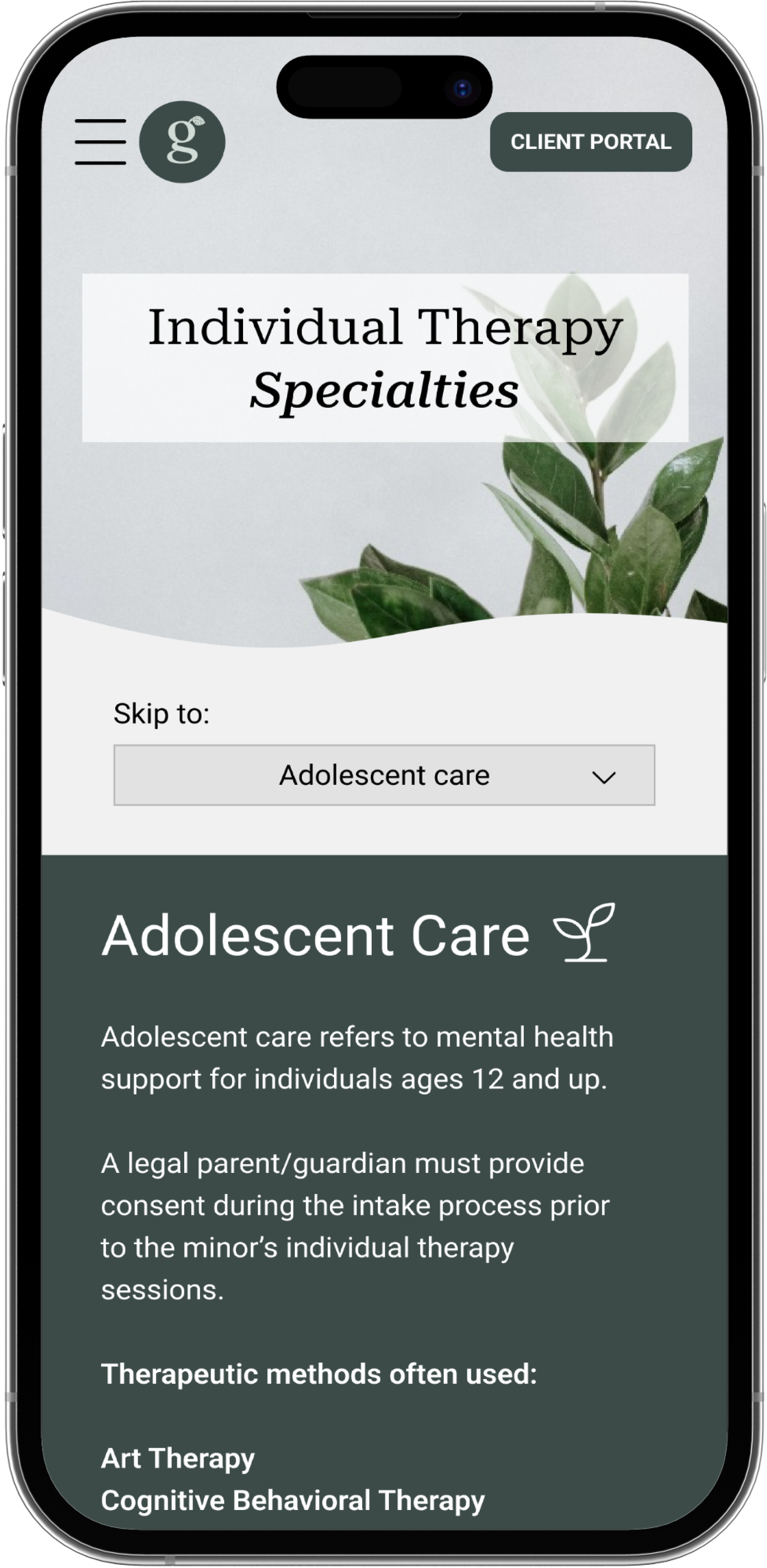
High-Fidelity Mobile Designs
I built a basic prototype with my final mobile designs so that my client could review the responsiveness of each page.

Test

User Testing
I tested the desktop prototype on 5 users. The tasks tested were as follows.
Locate and review information about the therapist’s background.
Locate and review the sliding scale cost breakdown.
Locate and review information about the intake process.
Schedule a free consultation for Thursday, 2/1 at 3pm.
My goals were to identify pain points within the user flows and to measure perceptions of trust toward the therapist.

100% of users completed 100% of tasks without errors.
100% of users correctly understood the sliding scale table.

The average probability that a user would schedule a consultation was 95%.
Improvement Opportunities
All users wanted to see an option to add a meeting link to their calendar upon scheduling their consultations.
Fix: Added an option to add meeting link to the user’s calendar in the consultation confirmation modal.Two users expressed the desire to list specialties in a dropdown from the menu bar.
Fix: Added the specialties to a dropdown.One user suggested a booking CTA on the Specialties page.
Fix: Added the schedule a free consultation button on the specialties page sticky navigation.
Conculsion
My client was very happy with the final product after the completion of Phase 1. Next steps include adding a video to her bio page and preparing to design Phase 2, The Client Portal.
I learned a lot from this project, and it challenged me to truly understand the importance of working within a realistic scope. Since I was only given a few assets to work with, it was imperative that I designed and wrote each piece of content with care while still balancing an efficient timeline.
I look forward to building upon this project with my client when she is ready to dive into next steps.