

FlyClean

A conceptual mobile app design that aims to improve the typical dry-cleaning experience.
Context
Client: UX Academy student project
Product: End-to-end mobile app
Role: Sole UX researcher & designer
Timeline: 100 hours
Tools: Figma
Background
I created FlyClean to refine my mobile app design skills and to explore a pain point that I have personally experienced for years - a love/hate relationship with dry-cleaning.
I uncovered that, in general, people use dry-cleaning services to keep their fabrics fresh and durable. These services also provide peace of mind to users who feel unsure of how to care for certain fabrics.
The average experience of using dry-cleaning services is often time-consuming and laborious. It requires the user to take four trips total, two of which include the transit of the actual items.

The user travels to the dry cleaners with their dirty items.
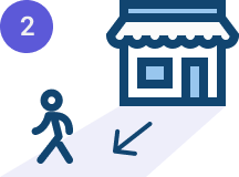
The user leaves the dry cleaners without their items.
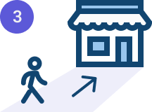
The user returns to the dry cleaners after days or weeks.

The user leaves the dry cleaners with their clean items.
Problem
Insights from my user research pointed to a significant problem with the experience outlined above.
People who use dry-cleaning services feel dreadful and avoidant about the process of travelling to and from their local dry cleaners.
Many identify this experience as a chore that requires a lot of effort and planning. These feelings are even stronger for users who do not own cars and/or do not have the ability to drive.
Goals
Understand the typical process of routinely using dry-cleaning services.

Understand how users feel about dry-cleaning and identify pain points in their experiences.

Explore how users would feel if they could order dry-cleaning services remotely.

Test the validity and success of a dry-cleaning pickup and delivery mobile app.

A preview of the solution!
Based upon user feedback, I designed a mobile app that solves for the need to order dry-cleaning services from local providers without physically travelling to the place of business.
Users can browse local dry cleaners, add items to their hamper, request pickup and delivery times, and process payments all from the comfort and convenience of wherever they are using their mobile devices.
Browse local dry-cleaning providers.
Add items to your hamper.
Schedule pickup & delivery.
Pay for & track dry-cleaning orders.

See how the project evolved!

The Design Process


Empathize

User Interviews
I interviewed 5 participants that had extensive experience using both dry-cleaning services and delivery apps.
Three of the interviews were done over the phone, and two were done in person.
The insights from these interviews are three-fold: The average dry-cleaning UX, the average delivery app UX, and defining the vision of combining the two experiences.
User Interview Insights

Defining the average dry-cleaning user experience:
Who and What?
Why and How?
Who and What?
Where and When?

Who: People who own certain articles of clothing or fabric items that need to be dry-cleaned.
What: Clothing and fabric items (i.e. business attire, formalwear, sweaters, coats, blankets, rugs, etc.)

Why and How?


Where and When?
Where: Typically a local dry cleaners with favorable ratings or recommendations.
When: Weekdays outside of business hours or Saturdays; frequency spans from every week to every quarter.

Why: To maintain the quality of their items while saving energy on cleaning the items themselves.
How: By walking or driving to the location, dropping off items, receiving a ticket, and returning in days or weeks to pay and pick up the items.
Common feelings dry-cleaning users experience

Dread before going.

Hurried on the way there.

Annoyed on the way there.


Accomplished after going.
Relieved after pick up.
Dry-cleaning user trends
100%
of users noted that dry-cleaning feels like a chore that they do not look forward to completing.
100%
of users said they need dry-cleaning services for specific items that they cannot or do not want to wash themselves.
100%
of users said they measure the trustworthiness of a dry-cleaning company by positive first-hand experiences and favorable online reviews/word of mouth referrals.
80%
of users said they wish their dry cleaners offered text or email updates on their order status.
Defining the average delivery app user experience:


Who: People seeking a convenient way to receive items that they purchase.
What: Meals, groceries, household items, personal care products, etc.


Where: Typically, the user is at home or at work.
When: Peak food delivery hours occur during lunch and dinner, while other goods are typically deliverred anywhere from 7am - 11pm any day of the week.

Why: To receive the things they want/need without disrupting their current state; To multi-task; To choose convenience.
How: By using mobile apps to find what they need, schedule delivery times, and pay for the items. These items are then shipped to them and are either left as a package or hand-deliverred if the user is physically present.
Common feelings delivery app users experience
Relaxed/Tired before ordering.

Slightly guilty while ordering.

OR swamped before ordering.

Excited after ordering.

Relieved when order arrives.
Delivery app user trends
100%
of users said they use delivery apps, because they are convenient.
60%
of users said they have experienced delivery location issues or delays.
40%
of users said they want to earn rewards points on their deliveries.
Defining the vision:

Users were asked to imagine how they would combine their dry-cleaning experiences with their delivery app experiences.
100% of users described some version of the following steps:
Find a local dry cleaners that is affiliated with the app.

Enter the type and quanty of each item in the order.

Schedule a time to get the items picked up and delivered.
Pay for the order and get an order confirmation.

100% of users also said they would try a dry-cleaning pick up and delivery app.
Competitive Analysis
I also conducted a competitive analysis on 3 adjacent competitors: DoorDash, Poplin, and Whole Foods (Prime). I chose to research DoorDash and Whole Foods (Prime), because both were mentioned in the user interviews. I discovered Poplin while researching popular laundry and dry-cleaning apps.


Competitive Analaysis Insights
-
Key Insights:
The search features are highly intuitive and versitile with extensive filters for users to choose from.
Users are able to reorder and save/find their favorites easily.
The process of ordering items is straightforward and predictable. The user adds items to their cart, pays for their order, and tracks the status of their delivery.
-
Key Insights
Upon opening the app, users are taken straight to the CTA to start a new order.
This platform is niche and specific to laundry cleaning services provided by Poplin.
There is not an option to select laundry cleaning services from local businesses.
Pickup and delivery seems tricky for busy users, because the timeframes are too vast and unclear.
-
Key Insights
The expected delivery time is given in two hour time windwos, which provides clarity and comfort to users with busy schedules.
Reordering past orders, editing quantities, and assigning substitutions is all fast and easy.
Searching is easy and can be specific or broad.

Define

User Persona
This is Jay. He represents the type of user who regularly uses dry-cleaning services but feels like the end-to-end process is extremely inconvenient.
Jay tries to simplify many of the chores in his life, because he puts most of his energy into his career and social l. He wants to reduce the time and energy it takes him to complete his weekly dry-cleaning, and he would love the convenience and predictability that FlyClean would provide.

After reflecting on Jay’s needs and challenges, I defined 3 HMW’s to help guide my designs.
How Might We…

Develop a way for dry-cleaning customers to use less time and energy to complete the dry-cleaning process?

Reduce procrastination and feelings of dread about completing the tasks associated with dry-cleaning services?
Create a way for customers to remain loyal to their trusted dry cleaners without leaveing home to use their services.
To help set me up for my sketches, I developed user flows based upon the tasks that my users identified as essential steps for using pickup and delivery services from home.
User Flows
Legend
Flow #1: User places an order from the list view.
This flow addresses the need for a predictable order, schedule, and checkout process that most users will be familiar with based upon their experiences with other similar apps.
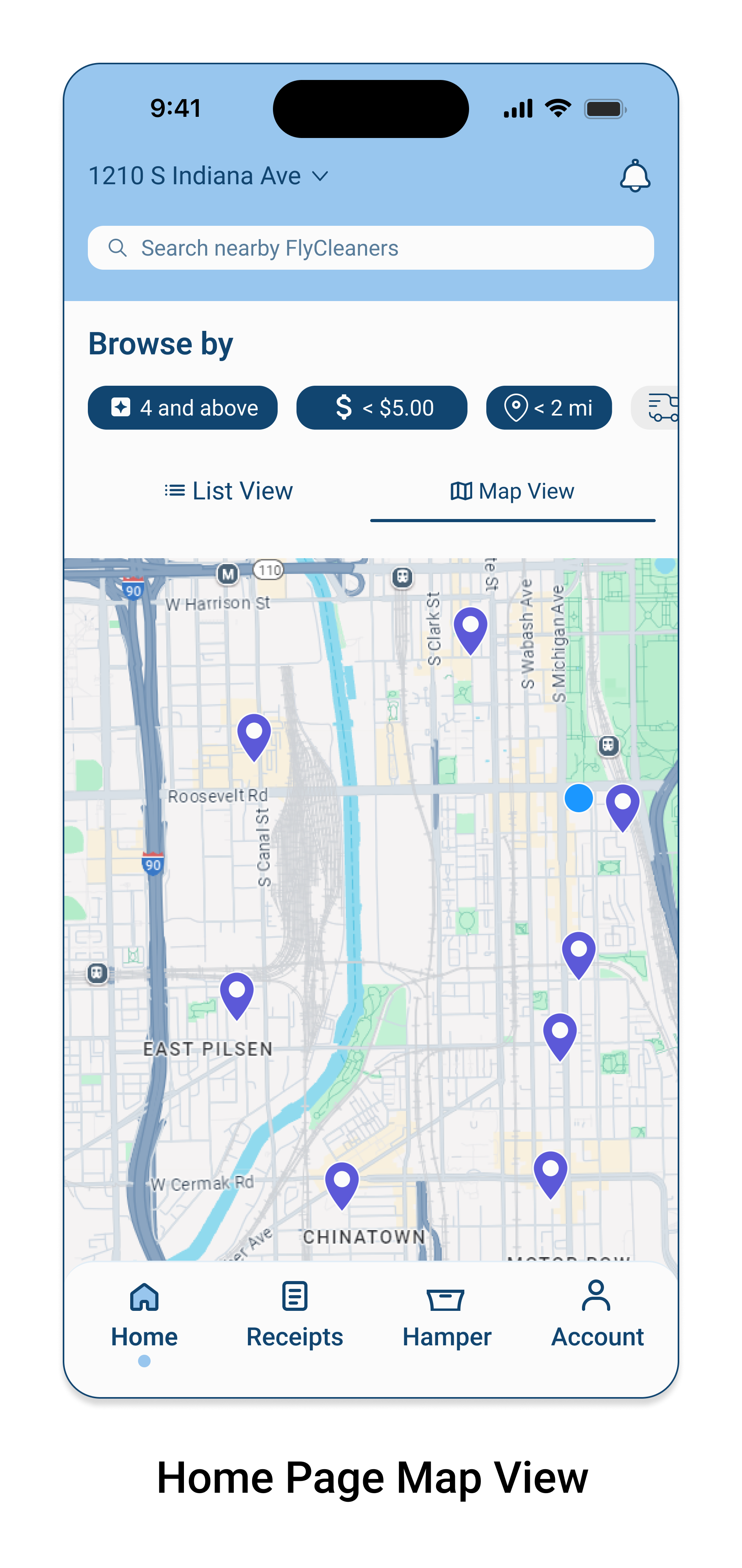
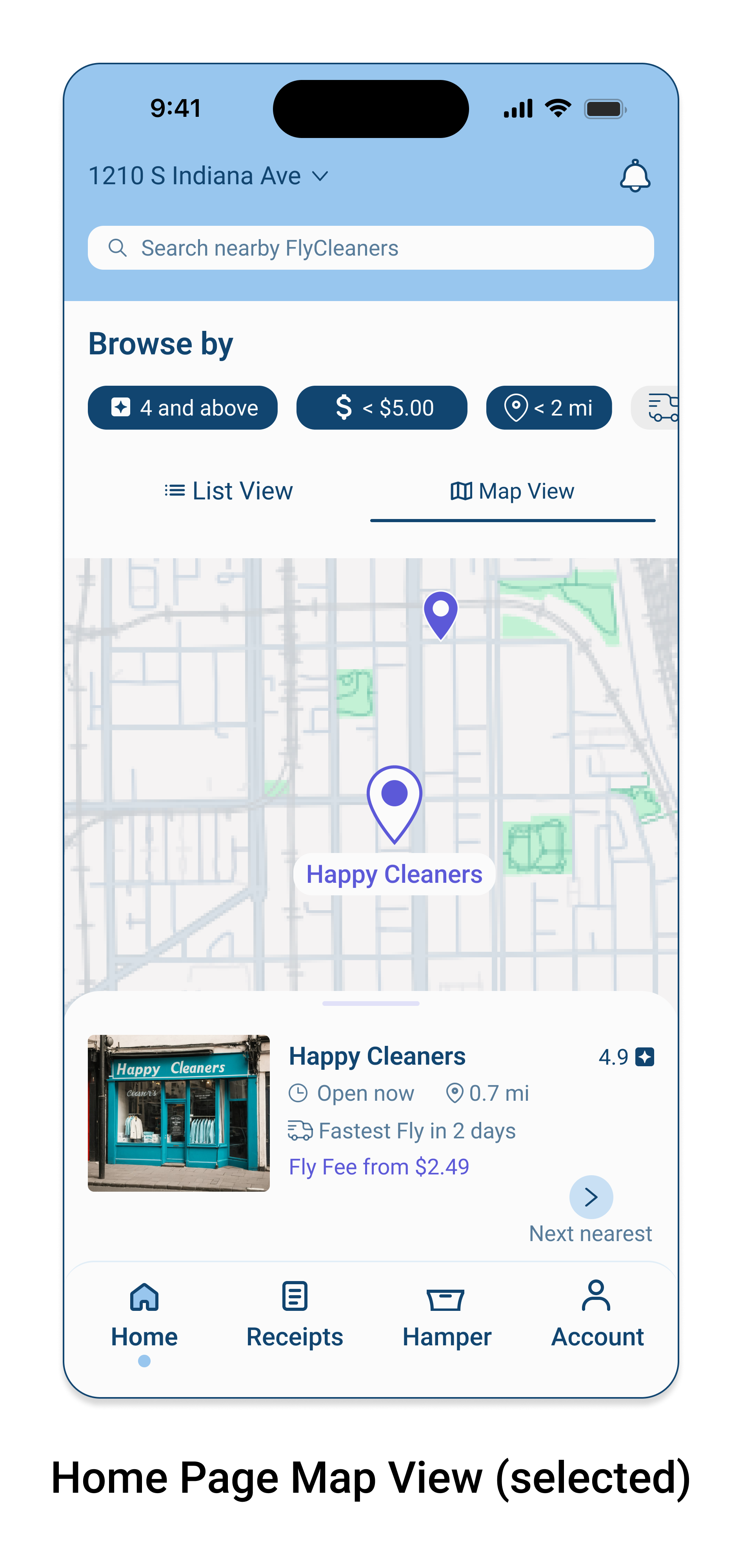
Flow #2: User starts an order from the map view.
This flow takes the user to the same place as Flow #1, but it begins with the map view instead of the lsit view. There is a slightly different interaction in the map view which also addresses a user’s need for familiar interactive designs in map searches.
Flow #3: Reordering a completed order
This flow satisfies the user’s need for efficiency and routine. Some users have the same items to get dry-cleaned every time, so this helps them skip the steps of adding the items to their hamper one by one.
Flow #4: Reviewing a receipt from a past order.
This flow considers users’ needs for quick and easy navigation to the information they need without experiencing confusion or headaches.
Ideate

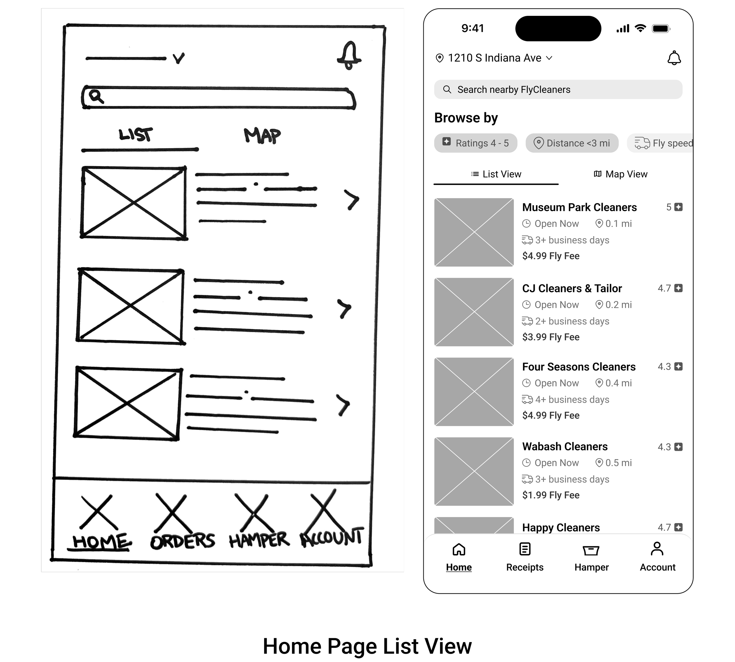
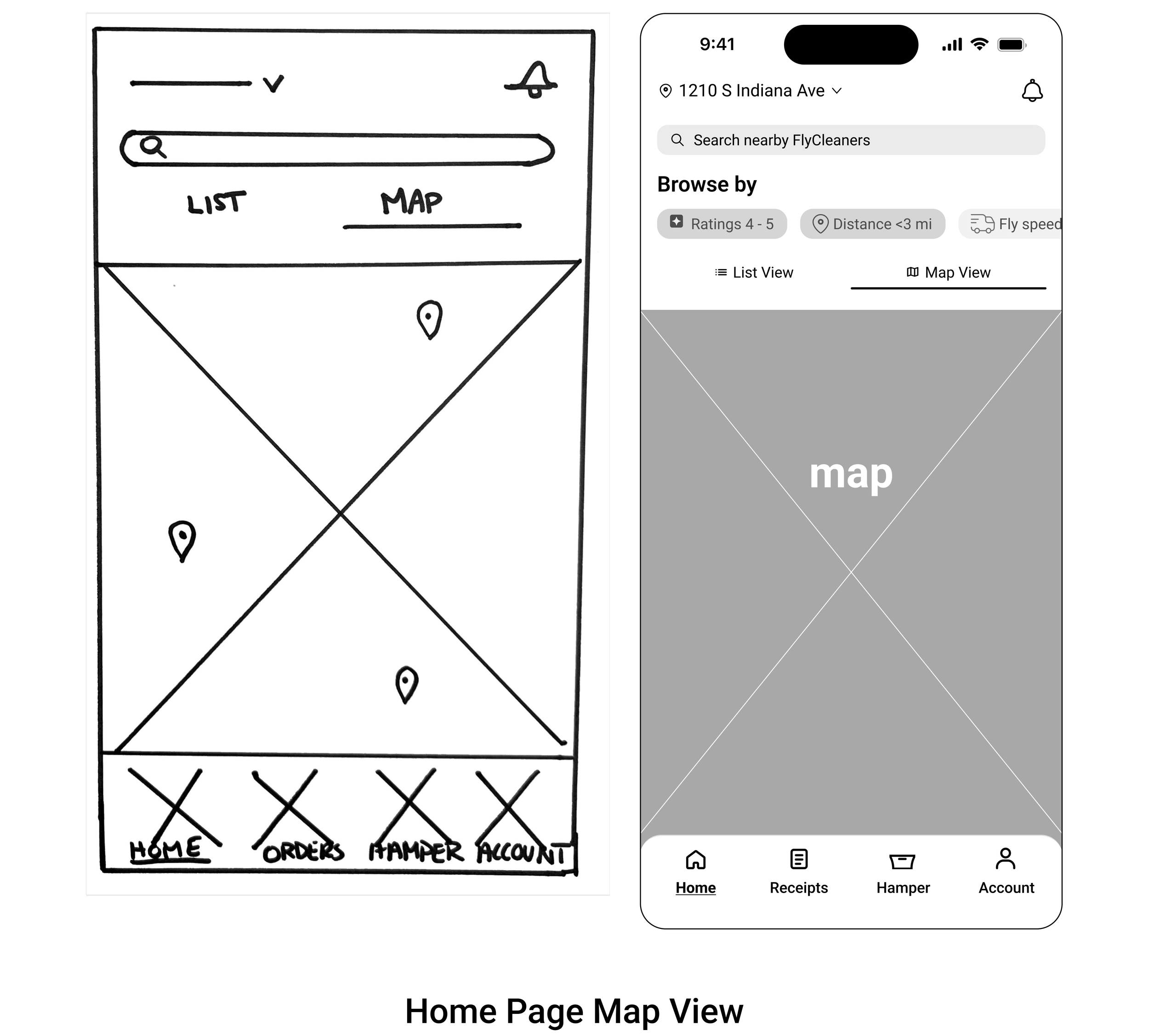
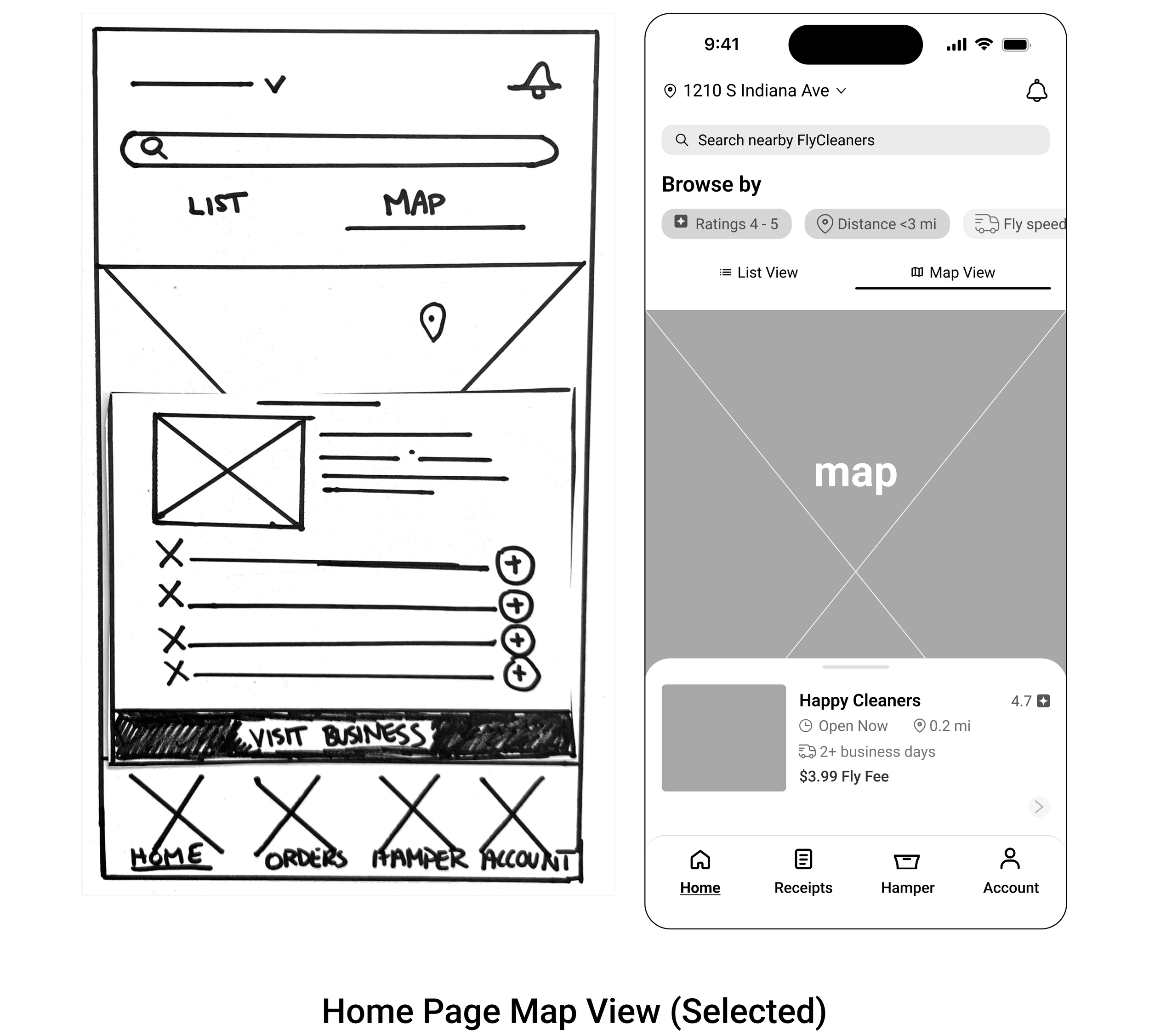
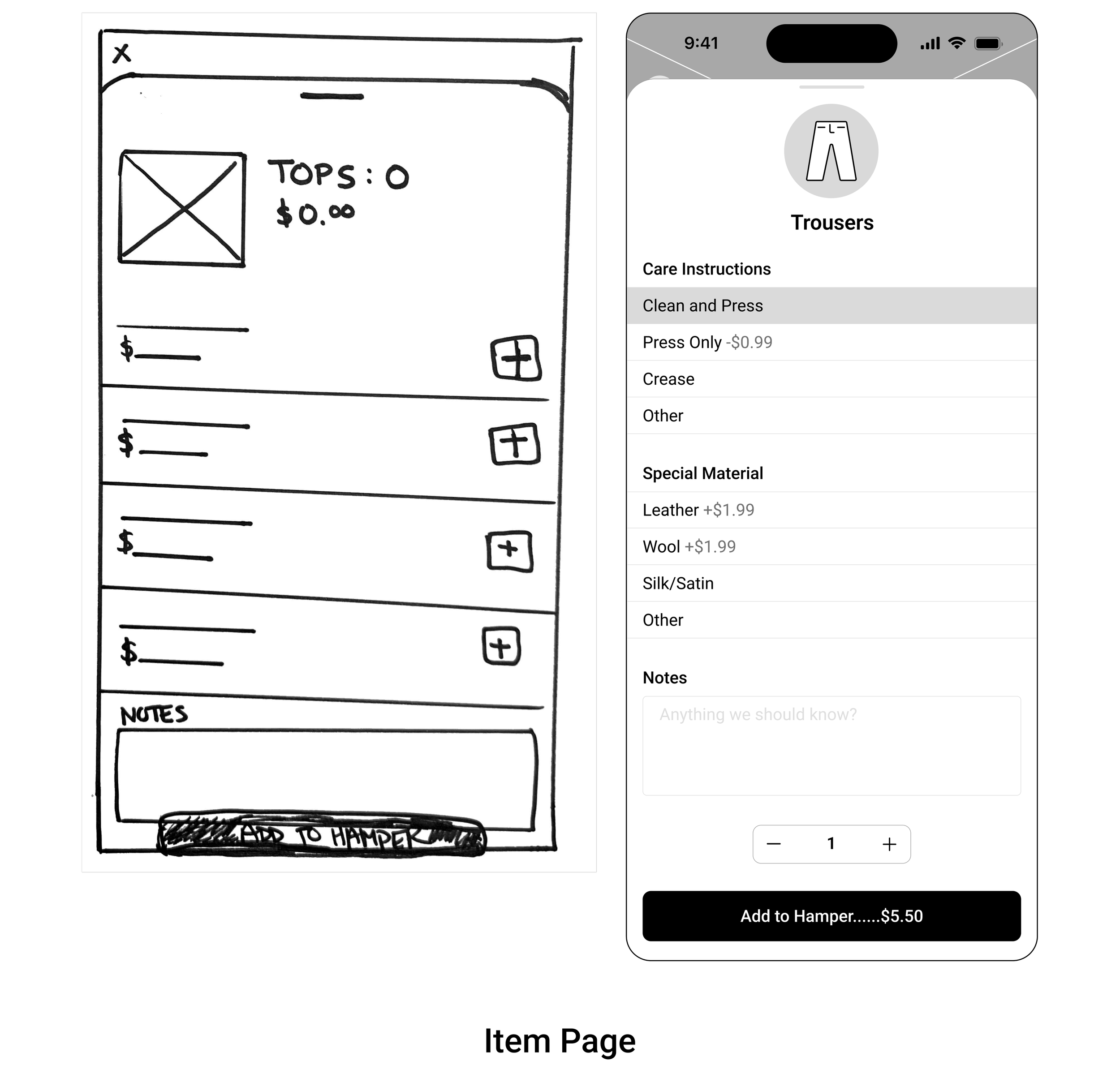
Low-Fidelity Wireframe Sketches
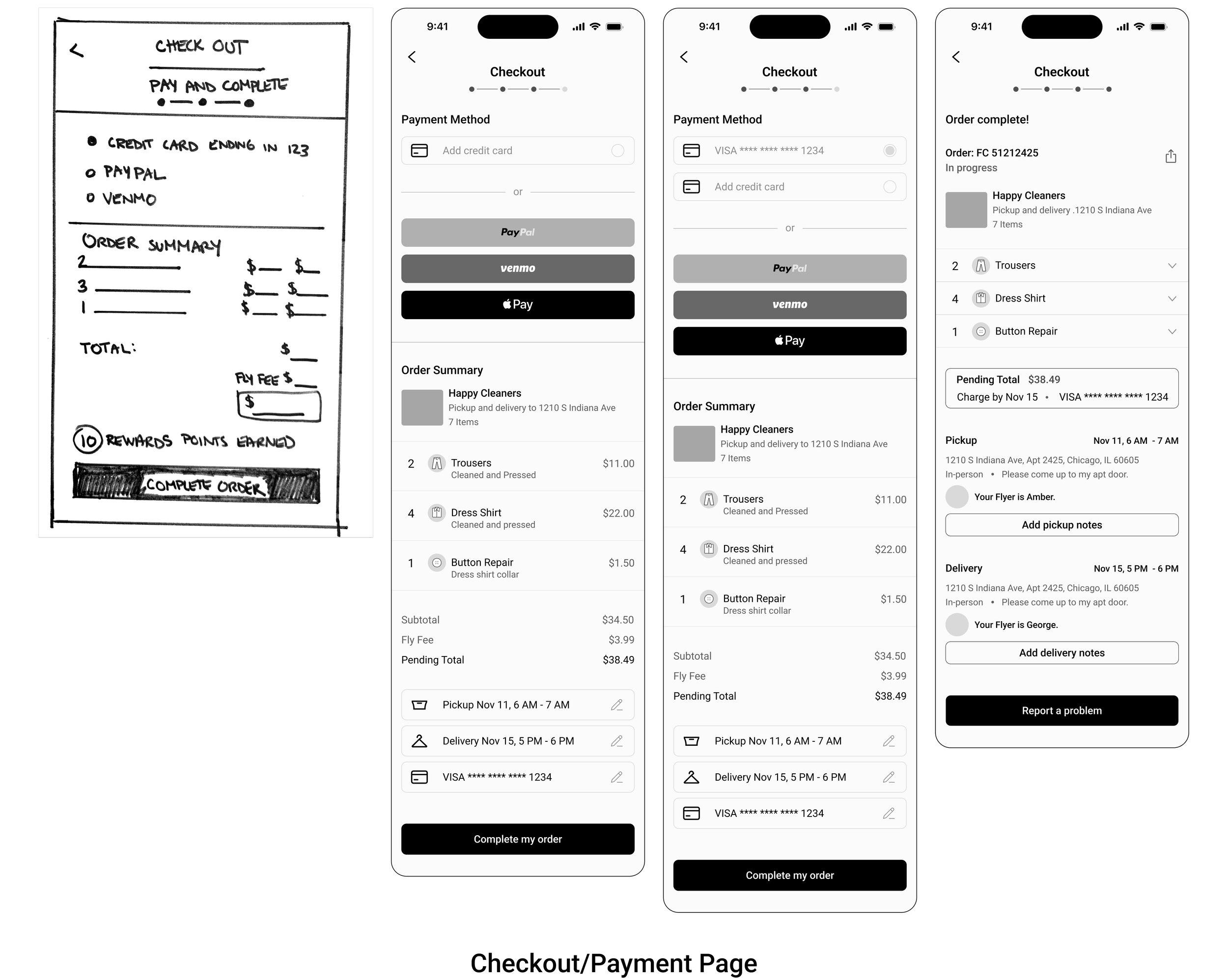
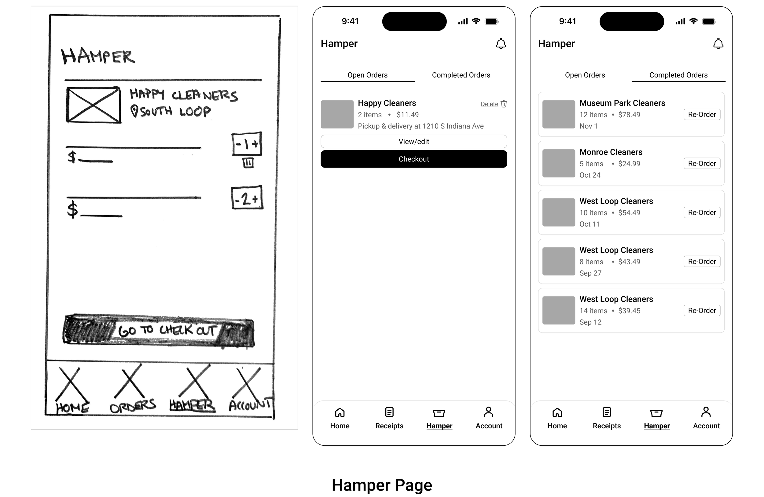
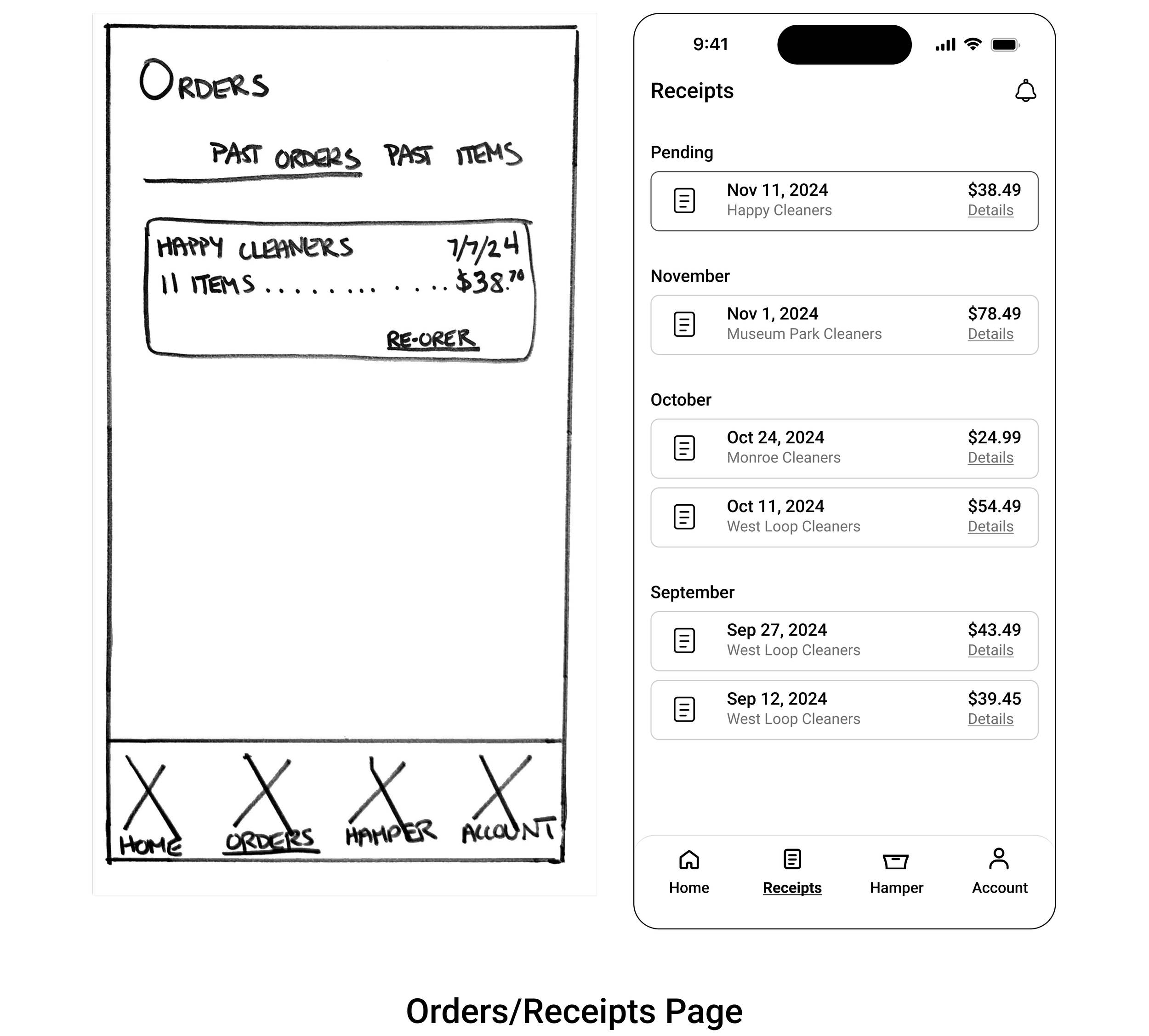
I began to develop my visual design ideas by sketching low fidelity wireframes. These sketches evolved once I turned them into digital designs on Figma.
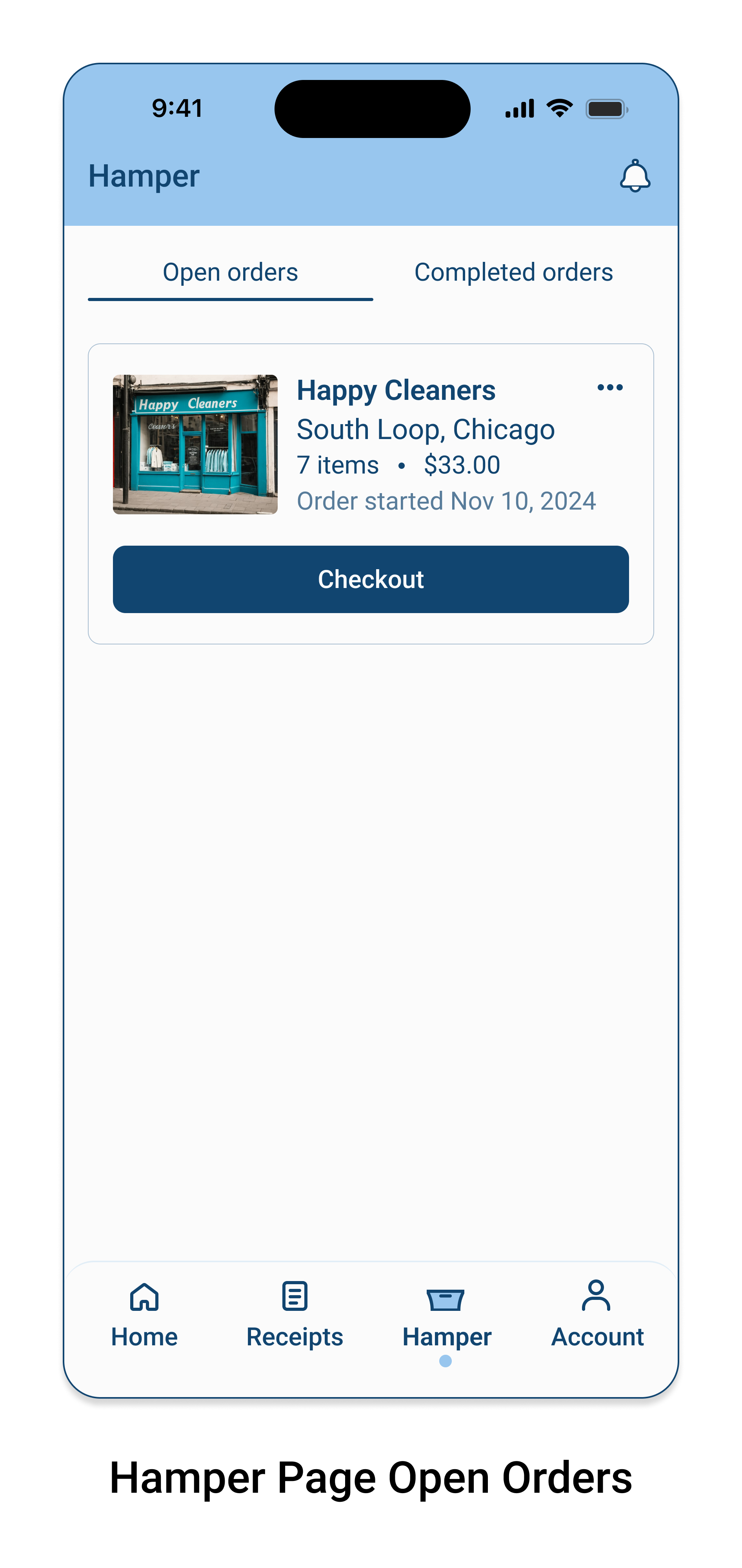
The biggest changes that were made took place in the Orders tab and the Hamper tab. After reviewing more examples of delivery apps, I realized that the shopping cart can serve as a place for past orders to be reordered. With that in mind, I created two tabs in the Hamper (cart) for open and completed orders.
Then I took the previously titled, Orders tab, and renamed it as, Receipts. The idea here was to create a quick and easy way for users to find their payment history.
Below are the images of the evolution of my low fidelity sketches to low fidelity digital wireframes.


UI Kit
At this stage, I created a UI Kit for FlyClean. I chose to implement an analogous color scheme composed of mostly cool hues.
I chose Roboto as a primary font, because it is accessible and neutral. I chose Lobster as a secondary font because I thought it would add a pop of fun and that it evokes hand-written calligraphy that a small business might use. The secondary font is mainly for the logo and to be used very sparingly in the app itself.
Finally, I wanted the UI elements to feel consistent and friendly like the logo font, so I mindfully customized many of the icons found in the app.
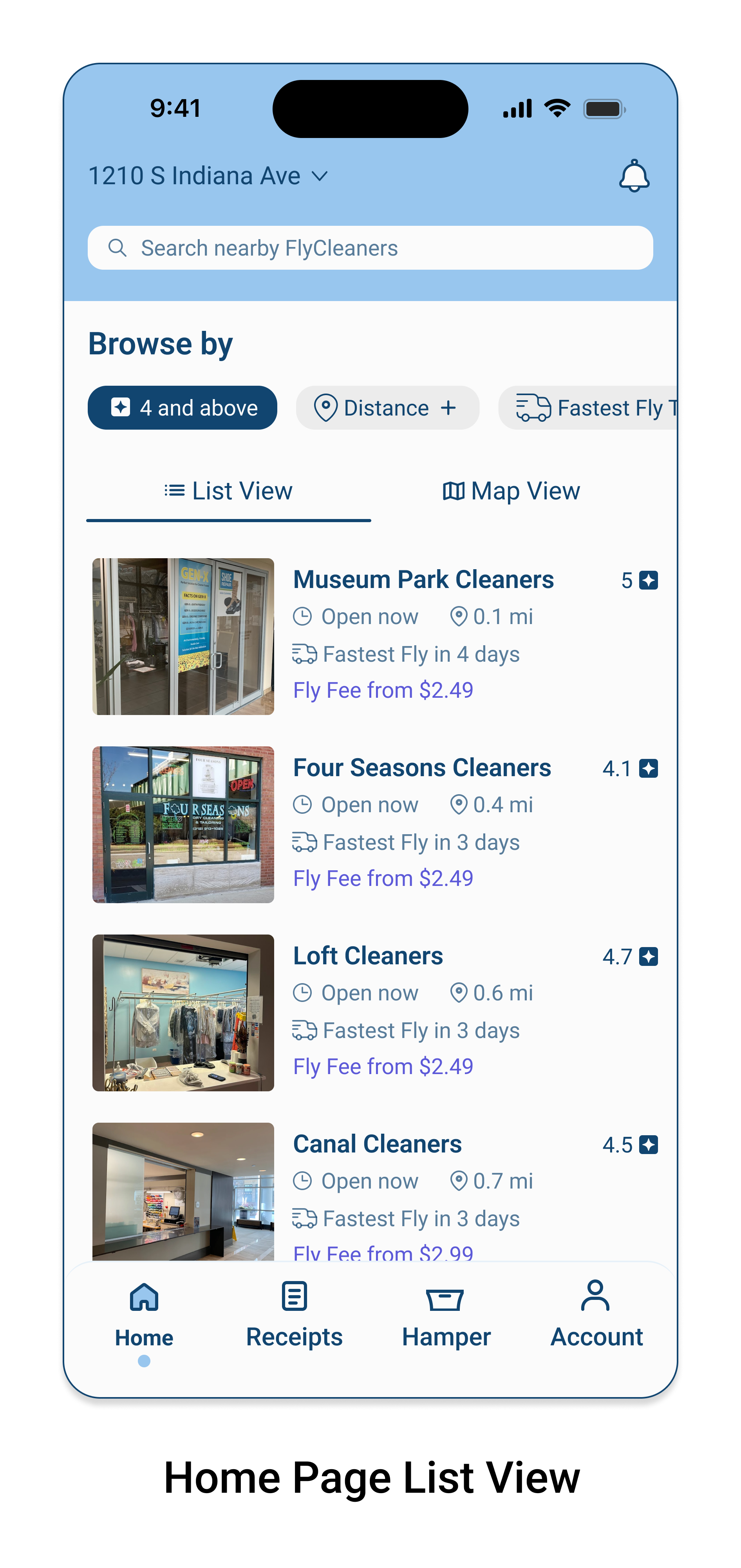
High-Fidelity Digital Designs
Next, I applied my UI Kit to the digital wireframes to create High Fidelity digital designs.


Prototype

High-Fidelity Prototype
This is the final version of the prototype after implementing the feedback gathered in user testing.

Test

Usability Testing
I tested 20 tasks from my prototype on 3 users. I recorded the following metrics to assess the usability.
Accuracy
Users interactions with the prototype were tracked and recorded to spot errors.
Clarity
Users were asked to rate the clarity of a task on a scale of 1 - 5. 1 = very confusing and 5 = very clear.
Ease
Users were asked to rate the ease of a task on a scale of 1 - 5. 1 = very difficult and 5 = very easy.
User Testing Results
Key Metrics

100%
Accuracy Score

98%
Clarity Score
100%
Ease Score
Constructive Feedback

User #1 / Question #13

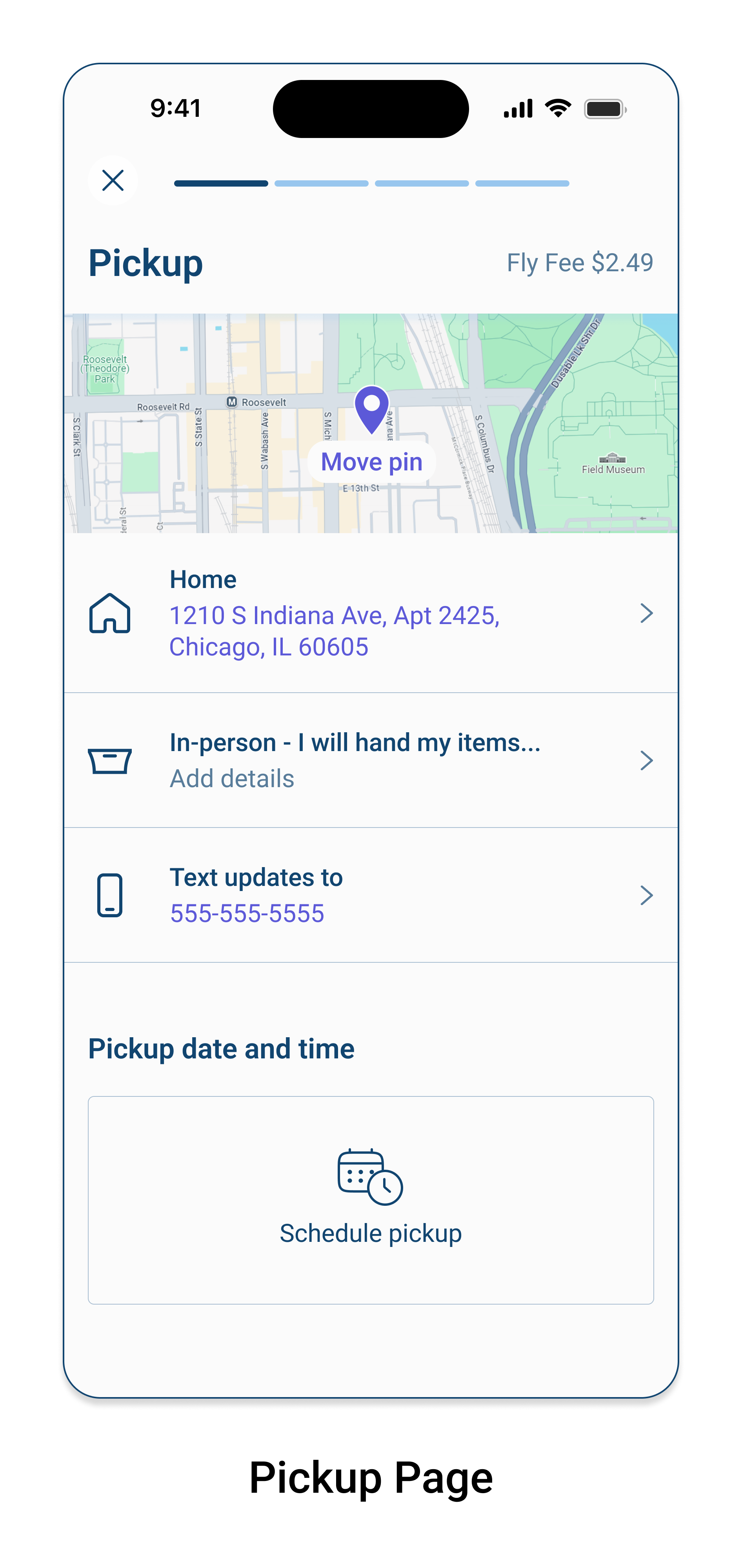
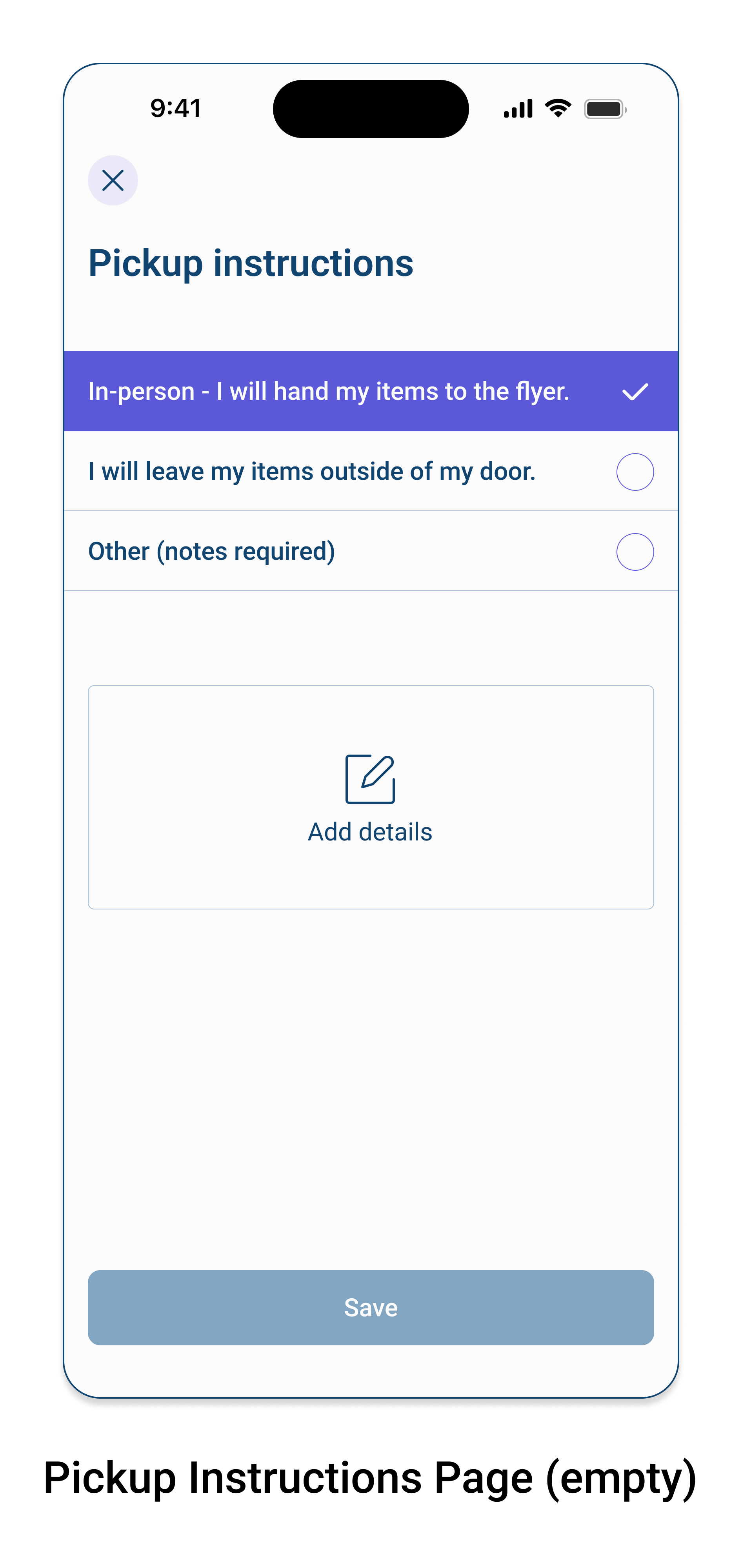
The user was asked to add details in the pickup instructions section.
“The wording in this section was a little off. It read to me like I was going to the dry cleaners in person.”
User #3/ Question #12

The user incorrectly interperated what was in the ‘Selected for you’ section.
“Top sellers or most frequently ordered by customers?”
Disoveries and Iterations
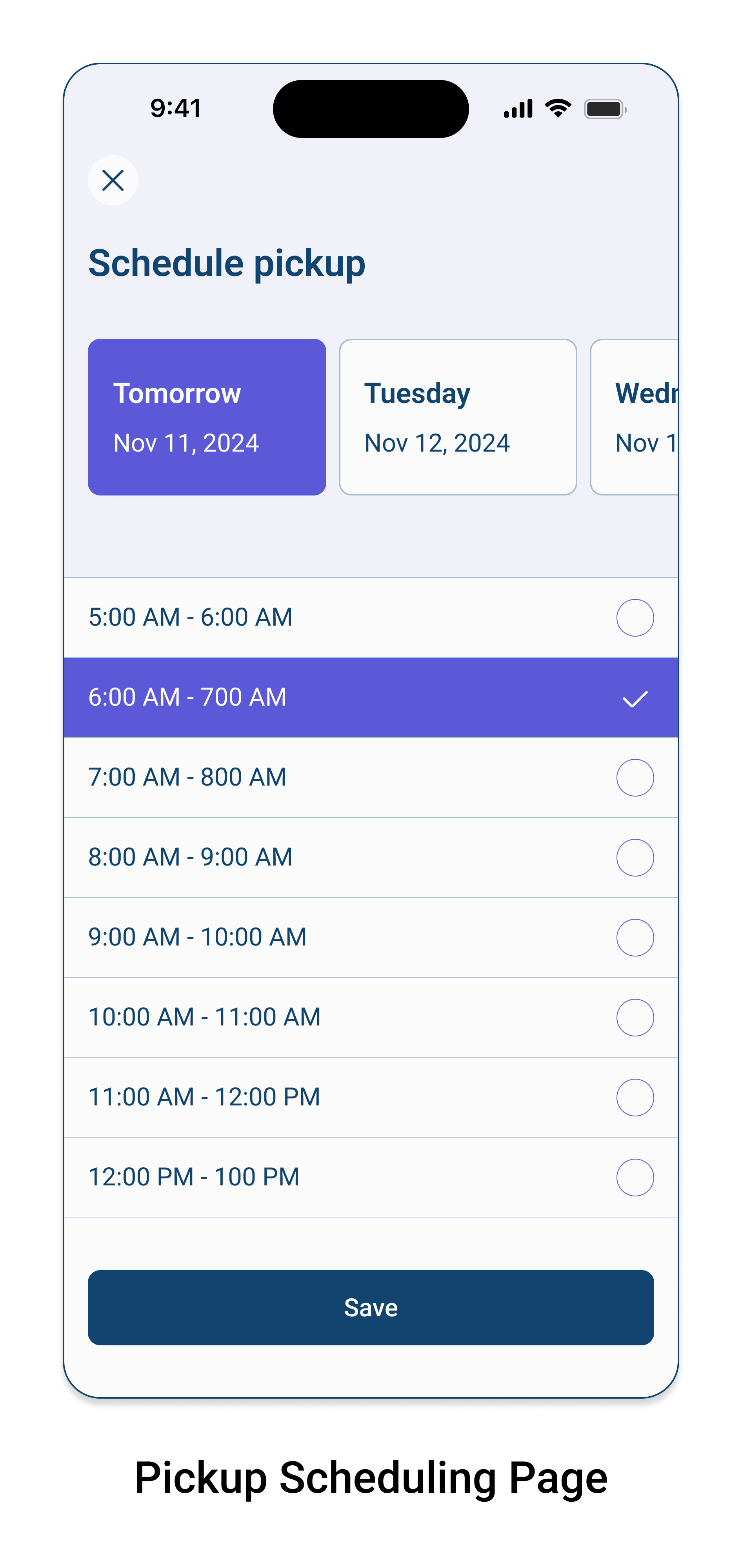
Added the missing colon in the 7:00PM time for scheduling delivery.
Set the menu bar to fixed at the bottom of the screen on the map view page.
Added a button to allow users to save their pickup and delivery details for future orders.
Changed the wording on, Selected for you, to - Your recent selections.
Changed the wording in the pickup and delivery instructions to, In-person - I will hand my items to the flyer.
Reflections
Designing a mobile app from conception was both challenging and enlightening.
I quickly realized that I needed to make assumptions about FlyClean as a business in order to design as if this was a real client.
Using companies like DoorDash and Uber Eats as my inspiration not only taught me a lot about delivery apps; it also gave me the opportunity to envision what it would be like to work on a complex project like this. I would imagine that there would be many more phases and resources than were within my scope and available to me at this time.
If I had more time, I would carry out these steps:
Build out the Account feature.
Build out the notifications feature to show how users track their orders and receive updates.
Develop a way for users to request delivery-only services on FlyClean for orders that were physically dropped off at a dry cleaners location.
Add a feature that allows users to log their dirty items throughout the week without tying them to a specific location until the user is ready to check out.
Add a feature that allows users to transfer all items in their hamper to another location if they decide to switch locations before cehck out.